LEO OBSTBAUM
PEOPLEText: Yurie Hatano
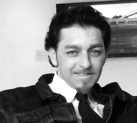
The graphic identity and pictograms for the Vancouver 2010 Olympic and Paralympic Winter Games are unveiled this September. The Vancouver 2010 graphic identity features many illustrated textures drawn from Canada’s natural and urban environments as well as its rich cultural diversity. All creative elements of the graphic identity were developed by VANOC’s in-house design team, with one key texture created by local aboriginal artist Xwa lack tun. Here, Leo Obstbaum, the design director of Vancouver 2010 shares us its creating process.
Could you tell us about yourself including your background?
I was born in Argentina, and moved to Barcelona at the age of four. I have been interested in the world of visual art since childhood. I studied Integrated Communications at Icomi school specializing in Corporate Identity. I opened my own studio in 1990, with a focus on fashion, music and film design. My professional restlessness and dislike of monotony has led me to explore different mediums such as print, broadcast, film, textiles, installations, video art and industrial design.
Professional highlights include the design of the wardrobe graphics for the multimedia opera “DQ, Don Quixote in Barcelona” by La Fura dels Baus, the identity for Adolfo Domínguez, and the wardrobe graphics for the anniversary of the Barcelona Olympic and Paralympic Games and the presentation of the Cultural Forum 2004. I was introduced to the world of film by movie Director Bigas Luna, designing the typography and collaborating in the main title design for “Volavérunt”. This collaboration was followed by the design of the promotion for “Son de Mar” by Bigas Luna, “No Somos Nadie” by Jordi Mollà, the design of the image and main titles, and post-production for “Fausto 5.0” by La Fura dels Baus, and the main title design for “En Construcción” by José Luis Guerín, among others.
Together with Miguel Marín, I created a series of audiovisual and multimedia installations. In June 2003, Marín and I presented a multimedia live show for the opening of the Sónar festival. In September 2004, I presented a video installation at the 10th Edition of Circuit during the Barcelona Fashion Week. My film “Beyond identity” was presented at the Sónar festival’s exhibition Randonnée, as a glimpse into the 21st century landscape. The film was also shown in the Hôtel Ritz, Paris, during the exhibition Zone, and in the Lovebytes festival in Sheffield.
In December 2005, I moved to Vancouver, Canada. Since May 2006, I have been working with the Vancouver Organizing Committee for the 2010 Olympic and Paralympic Winter Games as Design Director.
How did you start working for design direction of Olympics in Vancouver 2010? What attracts you to work there? What was your interest for the Games? And also, when did the project start?
I moved to Vancouver in December 2005 because I fell in love with the city when I first went there on my honeymoon with my Canadian wife. I went to the Vancouver 2010 website to find information on the Cultural Olympiad, and came across the job posting for the position of design director. I made a resume for the first time in my life, and sent to the Organizing Committee. Two months later, a lifelong dream came true. When I was in Barcelona in 1992, there was an Olympic design exhibition that seized hold of me, and I knew then where I wanted to be in the future. Like so many designers, I was very interested in the Games as a design platform. Although I’m not a person that plays a lot of sport, I’ve always been inspired by athletes, not necessarily the stars, but athletes in general. Seeing people that struggle every day for a dream, waking up early in the morning and training, while the rest of us sleep, and never giving up on their pursuit of excellence and perfection…it inspires me. I wanted to be part of this and create an environment that can help them to achieve their goals and at the same time inspire others, in different fields.
Could you tell us about the team members for the project? How many, brief background, how you work on the project, process.- Please introduce us the Graphic Identity and Pictograms and those concepts?
Our department, Brand & Creative Services, is responsible for developing many of the most iconic elements of the Games, including the emblems, the torch, the medals, the podiums, the graphic identity that becomes the Look of the Games, the sport pictograms, uniforms and the Games slogan. We also develop major communications like advertising and videos, and we act as the design studio for the Vancouver 2010 Organizing Committee on an everyday basis. We are also responsible for developing and managing the Vancouver 2010 brand and supporting our Sponsors, Partners and Licensees in their Vancouver 2010 applications.
The Brand & Creative Services team is co-managed by Ali Gardiner and me. Ali is the quintessential Canadian – she is half Scottish and half Japanese, and she speaks English and French. We manage a team of 24 people. They come from graphic design firms, broadcasting, the arts world, media, music, marketing and advertising, and we have an Olympic athlete as well. Our studio has a great mix of people. The majority are Canadian, but they come from different parts of the country and represent the cultural diversity that is so common to Canada.
The design process for the graphic identity and pictograms that will come to life as the Look of the Games started in March 2006 with a workshop that we held with our government and tourism partners representing Vancouver, Whistler, British Columbia and Canada. We wanted to hear from them what they would like to say about our land and culture. After the workshop, we started an intense period of research, where the entire team visited our venues at the same time of the year as the Games in 2010, to understand the weather conditions and context in which we would see the Look.
We traveled around the city as “tourists”, and spent many hours in libraries, galleries, stores, and any other place that might provide us with ideas and inspiration. We wanted to find what it was that most unique about Vancouver, Whistler and Canada, not just at a macro level, but also at a micro level. We searched for everything that was uniquely Canadian.
After our field trips, and particularly one on Vancouver’s North Shore, we found the answer. We were looking for words and images that would help us define the concept, and the word was transformation. As usual, the weather was constantly changing – transforming the landscape and light and atmosphere in a way that was very dramatic and full of energy. Canada is a country that’s in constant transformation. The country’s culture is always evolving because of the combination and fusion of cultures. The city blends with nature; they are all one. And water is everywhere. Vancouver is surrounded by water and mountains, making a very spectacular setting for the Games.
So we arrived back at the studio, and we started to create mood boards, to define what we were seeing in terms of words and images. We shared ideas, debated them, merged them, and kept playing until the final concept came to life. After this, we worked at defining a style, looking at trends and emerging styles, and trying to figure out how we could create something new and relevant…something unique to the West Coast and Canada. It had to be something that told the story of this time and place. We opened a blog where every day we posted images and ideas, and we covered our walls with hundreds of images, concepts.
Once the visual style was defined, we started to create designs. We knew what we wanted to say, but didn’t know exactly how we would do this. We tried everything that could be tried and more… and the conclusion was that Canada is not about one voice; it is about multiple voices that are unique but combine together to make something even more beautiful. So we worked a lot around the idea of fusion, combining contrasting elements like a graffiti wall with something natural, or combining the world’s western and eastern cultures. We eventually created all the illustrations, textures, patterns and elements that make up the graphic identity.
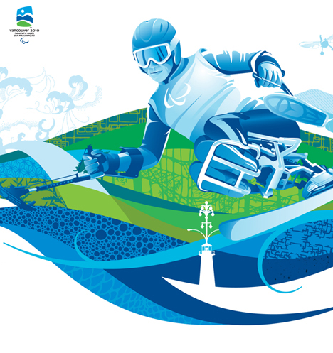
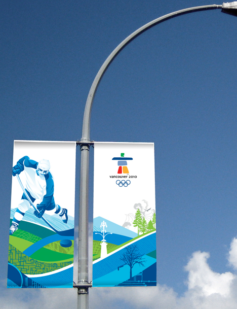
The identity is based on three layers. The base is made with colours and shapes that represent Vancouver and Whistler in way that captures its dynamics, dimension, youthfulness and progressiveness.
The second layer is made of illustrations that come from our urban and natural environments and our many cultures. All of them live in the same canvas…that’s Canada. The style had to be organic, and everything was originally designed by hand with ink to contrast with the clean and sleek base of the illustration.
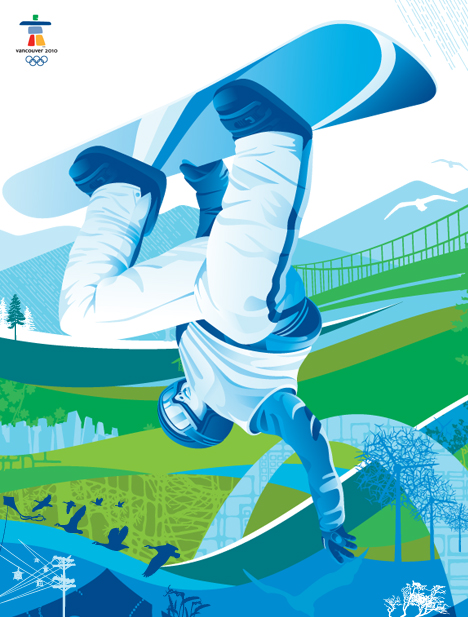
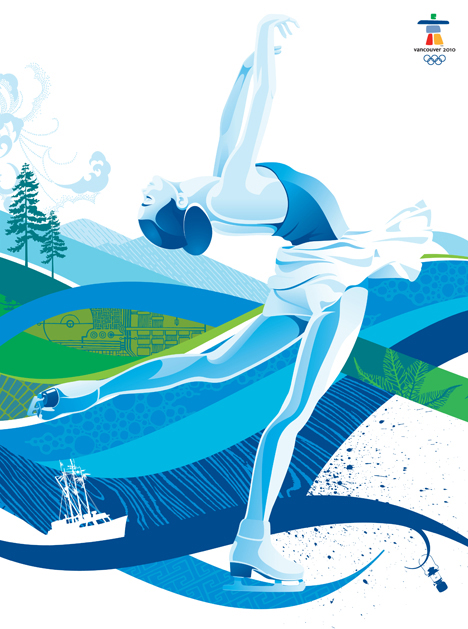
The third layer is full of whimsical images of unexpected “everyday” Canadian things – an electrical pole that transform into a tree, a float plane with dragon fly wings, a fire hydrant attached to an umbrella…These fantastical illustrations provide a fresh image of Canada, and capture a bit of our sense of humour and playfulness. We illustrated these in silhouettes in a vector style, so they felt modern and contemporary. All together, the three layers can be combined and cropped in infinite ways. The final crops will be unique for every application, yet integrated. With every application, we can tell a different story within a bigger story.
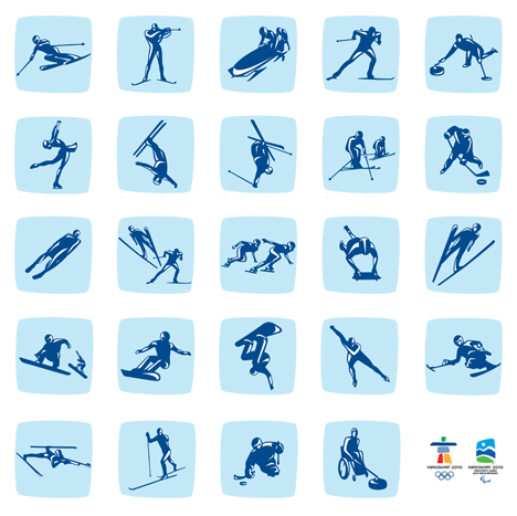
For the design of the pictograms, we wanted to do something original, to do something that has never been done before. Great pictograms have been designed for past Games Masters like Lance Wyman (Mexico 68), Otl Aicher (Munich 72) and Brad Copeland/Iconologic (Torino 2006) all developed great pictograms, so we knew this was a very complex element.
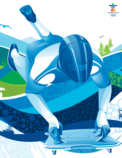
In the end, we based our pictogram style on the illustration, design and photography of pop culture, board sport culture, manga, fashion and music. We wanted to capture the intensity, action and motion of the athlete, and we wanted them to feel inspiring…alive. I wanted children to look at them and want to be like the athletes they saw.
We explored this direction with the design team, but we where not completely happy with our attempts, so we looked for the perfect “hand” to bring our idea to life in a style that worked with everything else we had done. We posted a request for proposals, and selected an incredibly talented illustrator – Irene Jacobs from Im-jac.com. Her style matched our concept, and she understood perfectly what we wanted to portray.
In the end, we created two levels of sport illustrations: the sport pictograms that will be used in maps, wayfinding, signage and publications, and detailed illustrations that are an extension of the pictograms. The detailed illustrations are full colour and bring expression, emotion and even greater dynamics to the athlete’s image. Everything was done by hand in the beginning, in the form of beautiful sketches. They were then translated into computer illustrations, which took hundreds of hours to perfect, but the result is very dramatic.
What did you learn from Beijing Olympics?
I have been following for years what Beijing was doing in terms of Olympic design, because the last thing that you want to do is to repeat what happened before you, and at the same time you want to learn from past Games’ success and their challenges. Beijing did an amazing job of sending one powerful message to the world about the new China – a modern country with a very rich history and wonderful traditions. Their Games design captured their culture, their history, and like Athens, it was a Look that was unique to them, and could not have come from any other place in the world.
There was enormous power and beauty in having one message spread throughout the city and venues on such a tremendous scale. There have been other Games and events where this kind of integration and coverage is not achieved, and so the final effect was not as strong.
Any influences from past design directors, including Min Wang?
I have studied past Olympic design a lot, and I am amazed, knowing the amount of things that we are doing, how they did the same back in the sixties without our current technology and production. From Mexico to Munich, from Los Angeles to Montreal to Barcelona, from Nagano to Torino, and finally Beijing, the work of past design directors is exceptional. I have a mixed style that combines rationalist and pop culture, and I think that this is what we will see here with Vancouver 2010. In all the past Games there is cohesive design, and they all reflect the city where the Games where held, and also to the moment in history. There is the psychedelic aspect of Munich 72, op art in Mexico 68, futurism in Torino, and the era of 100% Catalan design in Barcelona. They all did a great job, and it is a privilege for us to be a part of the tradition of Olympic design.
What will be your focus on the project from now to the 2010?
We are in the process of finishing the design of the torch, and are also working on the design of medals, podium, competition tickets, podium, Cultural Olympiad and Torch relay identities. We will have to create more than 200 publications from now to Games-time, including a commemorative book. There is still a lot to do. It will be an exciting journey.
Do you like any particular sports?
Like I said before I don’t practice a lot of sports, but when I was much younger, I skateboarded and snowboarded. I play football (or soccer as it’s called here) with my little daughter. And I love to watch sports, especially the ones where people defy gravity, like diving, ski jumping, and snowboarding half pipe.
Please leave a message to Shift readers.
I hope that you enjoyed finding out about the Vancouver 2010 graphic identity and the pictograms as much as we enjoyed creating them. We hope to inspire people not only about sport, but also about Canada’s culture and environment. If you have any opportunity to work for an Olympic and Paralympic Organizing Committee, don’t think twice. It will change your life.
If you want to find out more, you can visit us at vancouver2010.com. Canada will welcome the world in 2010 and you are all invited to enjoy this experience in this unique place.
Text: Yurie Hatano


