DSOS1
THINGSText: Joerg Radehaus
Who is developing the fonts (80!)?
Actually the book offers a selection of our own favourite 80 DS fonts. We started the DSOS project with 30 fonts and ended up with 100. It is a big pleasure to share them with the rest of the world now.
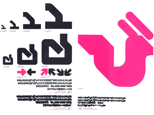
Left: The obscure charme of this typeface is espacially obvious when its used for copytext. In headlines it makes a hand-drawn, brush-like impression, despite its very geometrical character. DS Mufdi3D on the other hand seems almost technoid, stretching the font’s outlandish forms into abstraction.
Right: Relaxational exercise. DS Yogasan gives a clear, south asian inflection to any copy text written in latin alphabets. Just like the practice of Yoga itself, the typeface channels energy through the entire body of the text . The lateral connection strokes allow this energy to flow unhindered from letter to letter.
“Die Gestalten”, your publisher, is one of the publishing houses most en vogue at the moment. How did you get to work with them?
Stefan: We have known each other since I moved from Vienna to Berlin in 1996. They were kind enough to feature pieces of my work in various publications over the years. In summer last year Hendrik Hellige and Robert Klanten from die Gestalten Verlag came up with the idea of making a book and asked me if i would be interested – and I was. Very.
On your website, there are different games. In one, you have to rescue the rainforest to be able to create your own fonts. Do you think interactive playthings are able to save the planet?
Rob: Real world references seem to creep into DS work. I like this a lot. I think it saves us.
Stefan: The purpose of such work is to provoke such questions.
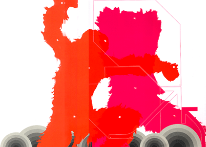
The fabulous opening sequence of Stanley Kubrik’s “A Space Odyssey” inspired this illustration for the DS-remix of the font Permutation 9. Self-imposed limitation, and the systematic pursuit of arbitrary rules in the form of a simple and strict matrix, have always been wonderful stimuli, and can lead to extraordinary results.
Is the trend to have a lot of gimmicks and gadgets, that developed recently in graphic design due to the interactive possibilities of Flash and other programs a means for you to create real communication?
Rob: It’s at an early stage. A lot of such work, including that from DS, is fundamentally about play and experiment. Everyone is learning. The possibility of designing the process of interaction, not just between people and machines, but also between individuals is very interesting.
Stefan: The DS Electronic Flyer Generator is a perfect example to create real communication and a perfect answer to your question.
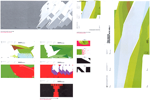
Classic, north-american, jazz-sleeve design, particularily those from Prestige in-house designers Miles and Hannan, were an important influence on the development of the DS ECG. The combination of robust, clear typography with a complexer illustration element was built into the layout of this tool.
What interests you the most in contemporary graphic design?
Rob: Antidotes to surfeits of eye candy. Whatever Stefan and Birte are going to do next.
Stefan: DON’T INNOVATE. IMITATE.
What are your current projects apart from Designershock and DSOS1?
Stefan: Doing interviews.
What are your plans for the future?
Stefan: Finding a small office to put our stuff in.
Rob: We need a modem upgrade and a proper studio.
DSOS1: The User’s Manual
[Booklet 240x280mm, 176P, CD-Rom including 80 fonts, 10 games, 25 screensaver, 55 wallpaper and 98 icons etc.]
Published by Die Gestalten Verlag Berlin
ISBN 3-931126-64-1
https://www.dsos1.com

Designershock
Address: Grimmstrasse 27, 10967 Berlin, Germany
Tel: +49 30 695 9660
https://www.designershock.com
Text: Joerg Radehaus


