RINZEN
PEOPLEText: Mayumi Kaneko
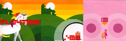
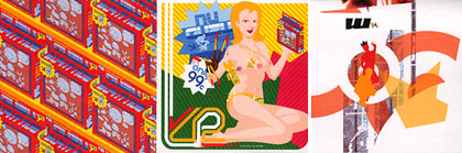
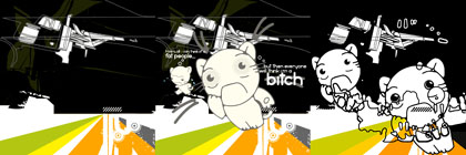
This month’s cover design was produced by Rinzen based in Queensland, Australia. Bending reality into shapes pleasing to the eye and the ear, Rinzen aligns the creative directions of the six members in print and web design, illustration, fonts, characters, animation and music.
First of all, please tell us who you are.
Rinzen is Steve, Karl, Craig, Adrian, Katrina and Rilla.
What kind of projects are you doing at ‘Rinzen‘?
We formed last year as a result of doing RMX// A Visual Remix Project, so from the beginning Rinzen was all play, no work. We’ve recently finished contributions for Matt Owens’ Codex 3 and Berlin e-zine Designer Shock 002. At the moment we are working on the first issue of SLIKA, a fashion/culture/art magazine as well as the visual concepts, from identity through to video projections, for super-club FAMILY.
Please tell us more about ‘RMX Project‘.
Each of us produced an initial piece to one of eight themes. The files were then passed progressively to each designer, being ‘remixed’ each step of the way, modified, added to and erased, and no-one saw the work before it was their turn to remix it. At the end of the eight week process the resulting 64 pieces were revealed. The results are a chaotic merging of vector and pixel work filled with colourful and repetitive design elements, some themes evolve gradually while others chop and change.
We launched the RMX Pack on opening night of the exhibition which contains a huge perforated poster, featuring the designs, an exhibition poster and a sheet of peel and stick Criticisms. The pack also contains a Music CD created entirely from digitally manipulated voice samples recorded at RMX handovers.
How did you get the idea to do the ‘RMX Project’?
The surrealists did a similar thing with words in their game ‘Exquisite Corpse’, inspiring a lot of musicians and artists to create in the same spirit. The project is spontaneous, fun and an excuse to do something without restrictions or expectations.
What was the hardest part of publishing the package?
Meeting every week to drink copious amounts of red wine!
Really the only challenge was finding sponsors who could understand the concept of graphic design as an end in itself. This was made more difficult by the fact that the results were completely unpredictable.
The project was exhibited in Australia and Berlin. How was the exhibition? And how was the visitor’s reaction?
The exhibition was enjoyed in the same way as the creation – drunkenly! Everyone tried to decipher who did what and followed the progression of the themes and styles. Berliners were keen to analyse what defined Australian design; while at home, the local street press said we obviously had too much time on our hands.
Read more ...


