
HIDEKI INABA “NEWLINE”
HAPPENINGText: Naoko Fukushi
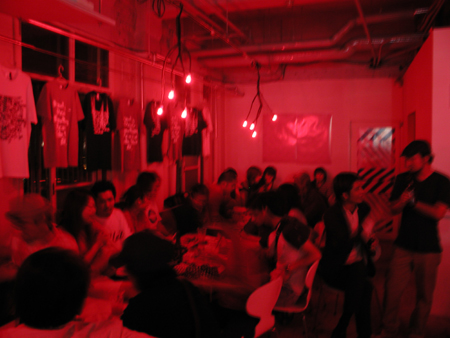
Graceful graphics, dynamic editorial design, graphical typeface born from a free way of thinking and feeling. Such is the philosophy behind graphic designer Hideki Inaba, and works with Shift on various collaborative projects. In Shift, you can find his fonts here and there, they are used for advertising visuals and on products such as the T-shirts for Shift Factory, etc.. broadly and flexibly under the name of “Newline”. An exhibition collecting such Newline projects which has produced so far , and showcasing them was opened at Sapporo Soso Cafe in June. On Friday, June18th an opening party with a Hideki Inaba performance occured.
It was the crimson lighting that first surprised me. Why red? It may be related with Hokkaido-born “E2O” project. He did the packaging design for a bottle of tomato juice as the first edition of “E2O”. In the hall, the special cocktail “red eye” using the tomato juice had also appeared on the menu. Furthermore, the original exclusive T-shirt was also exhibited and sold, which was born by a collaboration between Newline and Beams T.
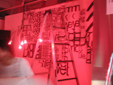
Soso cafe has a glass window that faces the outside. A translucent white screen was hung there to project Hideki’s red typography called “Burst Helvetica”. Since the screen was hung on the windowpane, a passerby who walked along outside could also see the image; the red typography and the red image which shook flickeringly aroused people’s curiosity to peep into.
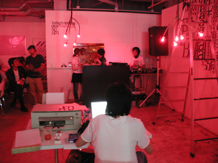
In such a red space, Hideki brought his work space; mac and a printer in the middle of the cafe, and he created a work on a pure white wall with 4m width 2.5m height. Although a lot of artist shows are live performances for the opening event at Soso Cafe, this style was one of the most unique.
Read more ...


