HIDEKI INABA “NEWLINE 2”
The first work of Hideki Inaba I saw, was the advertisement he create for iPod Japan in Relax Magazine issue 101 July 2005 and his Bursted Helvetica typeface for Shift’s cover design. Two very beautiful artworks with a great intense for details. I saw he spend a lot of time to do it. I was full with enthusiasm, as I hear he will have a performance at the opening party at Soso cafe.
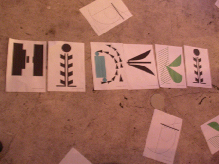
At 16th of September 2005, Friday morning his work arrives at the cafe, five posters with letters on it, two “N”, one “L” and one “2”. The poster were made for the exhibition called “Newline 2” a collaboration between Hideki Inaba and Shift. It was Hideki Inaba’s second exhibition at Soso cafe, the first one was called “Newline“. My first impression of the poster’s was, that their graphical language is different to the work I all ready seen. Different not in a negative meaning. The typeface of the poster’s have a very reduced, clear language, you see immediately the letter on it and if you do not, it is a nice arrange of abstract forms. I was eager to see the opening event.
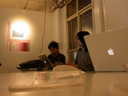
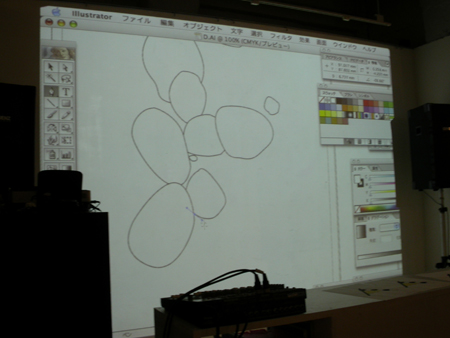
At six o’clock PM, all was prepared for Hideki Inaba to rock the evening. Beamer and Laptop were installed. At six thirty Hideki enter Soso cafe. He is a very slim men and at the first sight, he looks very likeable to me. After a few moments he sat behind the laptop and start to create items on adobe illustrator. He looked very relaxed and cool behind his working tool. Sometimes he drank a beer or talked to the people.
The first items, forms I did not recognize. The by the second and third, I saw that he create letters in alphabetical order. The creation looked very spontaneous to me, he create, he reject, he go back and he go forward. Hideki took elementary forms like line, circle and square and deformed them into a letter, guide by his free feeling for form and color. Each letter had his own character; one just with outline, one very geometrical, an other one with organic forms. Altogether the letters had an very raw but beautiful character, each was unique, nevertheless all together harmonize. It was a pleasure to look at his creations for me and the hole audience. Every finished letter he send up to the shift office to print out. In the course of the exhibition his print out’s were all over the room, like the spirit of Hideki Inaba.
Read more ...


