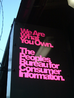
THE PEOPLES BUREAU
PLACEText: Sachiko Kurashina
“The Peoples Bureau For Consumer Information Tokyo (alias The Peoples Bureau Tokyo)” has just opened in Harajuku, Tokyo. This is the first real shop of the on-line shop “The Peoples Bureau For Consumer Information” run by The Designers Republic.
The shop used to be the Harajuku branch of Shop 33 but was reborn as “The Peoples Bureau Tokyo.” Interviewed with “Love the Life“, who dealt with an interior design, about the details of the design and this project.
Please introduce yourself. What sort of activities is “Love the Life” doing?
We, Love the Life, started to work in 1997. There are just two of us in Love the Life; Akemi Katsuno and Takashi Yagi. We have been mainly doing art direction in architectural designs and commercial facilities.
Please tell us about “The Peoples Bureau Tokyo”, which just opened on the 4th of October. I heard that you were in charge of the interior design of this shop. What brought you into this project?
“The Peoples Bureau Tokyo” is the world’s first real shop of the on-line shop “The Peoples Bureau For Consumer Information (TPBFCI)” run by The Designers Republic. It was April in 2002 when we got a phone call from Mr Aratake, the president of “Shop33“, to participate in this project. Also, in 1998, we had done the interior design of “33hrjk (Shop33 Harajuku branch)” in the same place where “The Peoples Bureau Tokyo” is now. We will talk about this later on but we think it was a natural course that Mr Aratake decided to take this project forward with the same project team of “33hrjk” since the geographical and social conditions of this location are pretty unique and we understand them well.
Tell us your feelings when you received this DR project. What did you say?
Ask DR to give us their signs!
I heard that Mr Ian Anderson from DR gave you the theme “transfer the colour scheme to the space as the scheme is”. How did you manage this task?
First of all, Mr Anderson explained his idea that he want to paint the space in red, white and gray from top to the bottom as the web screen of “TPBFCI”. Also, pink is using within the web in order to make important points stand out, and he wanted to use fluorescent pink to paint some pillars and beams. In other words, it can be said that he had showed all of the basic points about the space design at this stage.
This sort of simple and strong idea was very DR and directing transferring a virtual space into a real space was really exciting task for us. However, we knew that we would have to add another important idea in order to make these ideas not only just a decoration but also an architectural design.
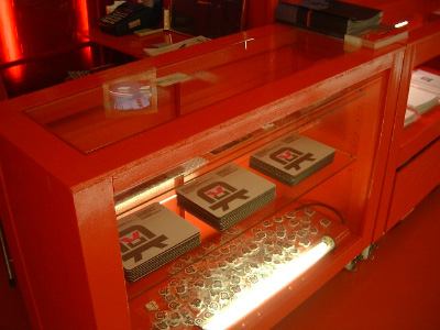
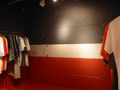
As you can see in the web site of “TPBFCI”, the red part at the top is a table of contents, the gray part at the bottom shows images of products and data, and the white part at the middle is a functional area where customers can select each item. The colouring system there is not a mounting thing at all. It is a silent (but strong) index in order to make customers have an intuitive shopping experience. We thought we want to transfer this experience, which is hiding behind the “TPBFCI” site, into the space somehow.
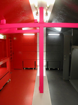
Photo by Love the Life
If you go up the short stairs and enter “The Peoples Bureau Tokyo”, you will see the emitted white bump (H 200 x W 400 mm) laid down at the middle of the shop. This white line works in order to separate the space into two parts and the line goes around the shop from the floor to the walls and the ceiling. The entrance side from this white line is painted all in gray and it’s in red over the line. By setting these zones, the gray part works as displaying the products and the red parts, where the staff counter is, works as a guidance function of the shop, but both of them work flexible. The most important point here is also this white line that we previously explained. This is because it is impossible to enjoy shopping without getting or crossing over this troublesome obstruction.
This sort of device has got a sense of mischief but it can be said that this most low-tech and spatial mean brings an active relationship between customers and the shop. Of course, having high-tech machines, motions and sounds is another possible means. However, we think the former simple mean is more appropriate for the DR shop. Moreover (and thankfully), we did not have a big budget for a luxurious facility.
Read more ...


