LONDON & BRIGHTON GUIDE DVD
THINGSText: Sachiko Kurashina
It is a good point that creators, who we could get to know only through their works, talk in front of a camera and introduce their studios and towns from their point of view in this DVD. Please tell us the things you felt after hanging around the town with them. Did you find something like a common point as British creators from them?
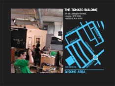
I enjoyed walking, talking or sometimes having a meal with them. I could see their daily aspects that I never felt from their works. All of the creators kindly took us around the town and they were cooperative. It was a valuable experience for me that Graham Wood shyly introduced Tomato building. I hope you can feel it in DVD, too.
The reason why I thought this is not a usual town guide DVD is that I noticed I was attracted by the images with full of art tastes when I watching this DVD. Editing and art direction are especially unconventional. Who dealt with them? How did the image editing go on?
The contents of this DVD are divided into three parts. Power Graphixx was in charge of editing the part of “Tomato” and a/o was in charge of rest of them, “Red Design” and “Ben Sansbury”. Both of teams are young and the most notable creators at the moment. Basically, I let them freely edit and direct each part and I checked the images and structures at each stage several times. However, both teams made interesting stuff and there was not necessity to make changes. In terms of the parts of Red Design, it was a hard task to decide which parts we select from more than 15 mini disc tapes (more than 15 hours long).
There is a mean that is different from TV and a methodology that works in something like a DVD that is not supposed to be on air. Shooting with one DV camera (sometimes two) and a low budget. We did not use pin microphones and gun microphones in this time. The staff were a cameraman, a translator and I.
The graphical approach was sometimes used in order to hide rough images and sounds.
I think, however, this is a proof that the added value of graphics properly works in images as a design and this was the objective of this DVD. Making a usual documentary work is a piece of cake if you have got high quality images and sounds. However, when the images and sounds I have are not good ones, I think it is possible to express the interesting and enjoyable points of images with using a graphic editing.
Please pick up the difficult points and good points when you were making this DVD.
I admit that there are still green aspects in this DVD but it is made as the one that has not been made ever before. Graphical editing is also new that you have not seen in other works. However, the speed of consuming images is quick. Thus I think it will be a hard job to find out a new way of expressing and a different approach each time.
Please tell us your future plan.
I am making a sequel version of this, called DVD “Paris Guide DVD” at the moment. If possible, I would like to make “Paris Guide Book” with this DVD.
I personally would like to start projects with images + graphics from now on. I am thinking I can make a new expression by using the media, prints and DVDs separately or together so far. A new magazine is on the way to be published and it will sharply feature not only creators but also others. A bit big project is now dealing by autumn. Please look forward to it.
London and Brighton Guide DVD
Specification: Approx 68 min, NTSC/Regional code is ALL
Price: 3,900yen (tax out)
Manufactured by Newsbase, inc
Text: Sachiko Kurashina


