
LIZ FABER
PEOPLEText: Nicolas Roope
In the five years that Liz has been with the magazine she has seen some incredible changes in the world of commercial art and design.
The magazine has been around for nearly 50 years and is consistent with it’s original aim: to publish interesting and innovative developments in communication and art which has been commissioned, (meaning any work where a client has commissioned a creative person or agency to carry out work on their behalf.)
The magazine’s interest is in mainstream communication forms like packaging, TV commercials, pop promo’s and record covers. As a documentation of these popular forms, the magazine serves as a window to the ever changing style and emphasise of advertising and design. As Liz puts it:
“It’s a slice of pop culture. It’s dealing with everything POP; packaging, promo’s advertising, photography. It’s quite funny looking back at the eighties and seeing how far we’ve come.”
But it’s not only the contents of the publication that change.
“The way the magazine is designed reflects the trends of the time so at the moment it’s probably quite clean.”
Other than stylistic changes, the magazine documents a shift in the creative industries as a whole. We see design becoming more central, competing with the more advertising led approach of the eighties. Liz thinks that this is something to do with the fact that on the whole, people have become much more aware of design and this has an impact on all levels. Design is more important to consumers and therefore everyone including the agencies have to adapt when they acknowledge this.
Agencies used to outsource a lot of the work to small production units who were specialised in moving image, typography or whatever. On the increase today is a tendency for clients to take their business to agencies that can offer all the design in-house. That means that a new breed of agency has emerged which doesn’t shy away from projects that don’t fit into the traditional advertising model. Agencies like Mother and Circus would take an offer to make a short film or write a book as part of a promotion very seriously, whilst other’s wouldn’t see it as part of their remit. As an example Liz explains that Mother produced poster and TV advertising for Channel 5, as well as the identity for all their communications both on and off screen when they launched. It is unusual to work this way but the benefits are clear.
The approach is a tendency that the larger agencies are following closely.
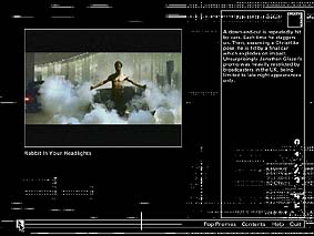
Creative review was early in its’ acceptance of interactive media as a creative form of communication. The cover disc which first made an appearance on the front cover of subscribers issue in 95, which Liz admits was a time when a large proportion of the subscribers still didn’t have access to CD Rom drives. She also remembers how the design community were ahead in this respect, being much more likely than the agencies to have the drives.
The disc has had a very positive impact on the publication.
“The CD has served to bring the magazine to life. Seeing it and playing it is a much more full experience. The subscribers use the magazine and the CD Rom together to keep in touch with what is going on.”
Liz confesses that in terms of the web they have not done enough on the web to reach a potentially massive audience interested in the issues covered.
“There are only 300 subscribers outside the UK. If we had a decent web presence we’d entice more people.”
But of course as we all know, this brings it’s own set of problems. However there’ll be something before too long.
“We’re trying to lay a path so that the transition to the web is easier.”
Read more ...


