
SEMITRANSPARENT DESIGN
PEOPLEText: Mariko Takei
Semitransparent Design is a creative team that operates across boundaries between the latest media technologies and design. Since their start in 2003, they have come to the forefront with their commercial work that connects the actual space and web space. An art unit emerged from the team, Semitra exhibits their first solo show “tFont/fTime” at Yamaguchi Center for Arts and Media [YCAM], exploring their new approach on a typeface and time. Shift has interviewed one of the members of Semitransparent Design, Ryoji Tanaka.
Please introduce Semitransparent Design.
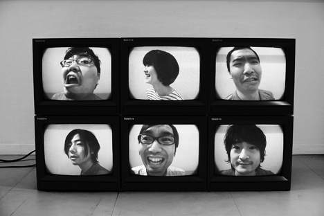
We are currently formed with 6 members, consisting of 3 sections of graphic, program and device development. Graphic designers include Ryoji Tanaka, Hiroshi Sato and Emiko Kashiwagi, programmers are Yusuke Shibata and Shunya Hagiwara, and the device developer is Toshiyuki Sugai.
YCAM “BIT THINGS” (2003)
Why and how did you form Semitransparent Design in 2003?
We formed Semitransparent Design aiming to pull out the web potential with creative (design). For our first work we created a website using a creative space BIT THINGS at YCAM, which worked in conjunction with real space and web. Since then, we have worked on various web advertisements with the idea and production framework.
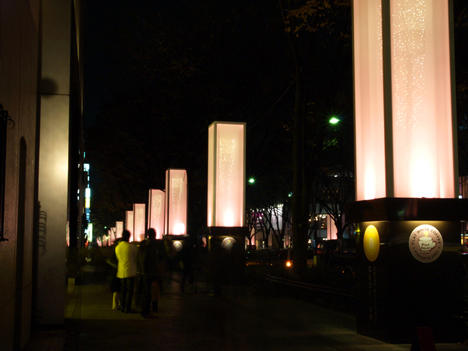
akarium Call Project
You work on a wide variety of genres including web designs, graphics, interactive designs, films and prints. Could you introduce some of those past works?
One of our major works is “akarium Call Project” in 2006, which is an interactive illumination of the 60 big lanterns installed in Omotesando, flickering in response to the participants voice via mobile phones. As you dial to a specific phone number and tell a message over the phone, the light in Omotesando flickers in response to the voice. This activity was live on the net, so anyone could join the project and watch how it worked.
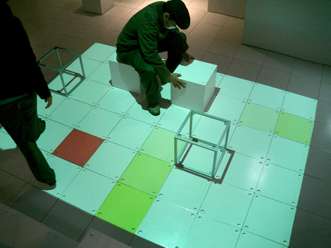
BEYES Interactive Interior “Skew”
In 2007 we participated in the promotional project for Sony BRAVIA “Color Tokyo! – Live Color Wall Project” that changes colors of LED light on a building exterior wall using a website. Through the website, an user picks a favorite color with a dropper and as he/she drops it on the film work screened on the wall of Sony Building, the color of the light on the wall changes. Beside this, recently, we worked on the CI for a hair salon “SUPERSTARS“, the interactive interior for BEYES at Omotesando Hills, and the website for Ando Gallery.
Could you discuss the differences between Semitransparent Design activity and that of Semitra? For the exhibition at YCAM this time, you work as an art unit Semitra.
Our basic approach towards web media is the same. We call ourselves as Semitra when we work on the commercial works. For the exhibition this time, we have been involved not only in making works, but also in working on overall visuals including flyers, posters and a website. So for the exhibition, we call us Semitra as an artist name, and Semitransparent Design as a supervisor for the project design.
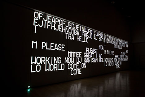
Semitra “Movable Type” (Yamaguchi Center for Arts and Media [YCAM], 2009)
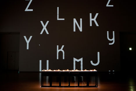
Semitra “Typesetting” (Yamaguchi Center for Arts and Media [YCAM], 2009)
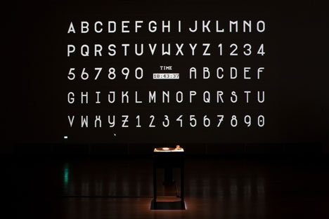
Semitra “California Job Case” (Yamaguchi Center for Arts and Media [YCAM], 2009)
You are currently exhibiting Semitra’s first solo show at YCAM with a theme of “Typeface with a temporal moment”, showcasing installation and web works. Please introduce about the exhibition?
After we exhibited our original typeface “tFont” at OPEN SPACE in NTT Inter Communication Center [ICC] (Tokyo) in 2008, we explored the concept, creating new works and worked on a theme “fTime” in addition to “tFont”. We made various works utilizing turntables, snowboard halfpipes and LED. You can of course participate in the installation via website and it is possible to watch it live as well.
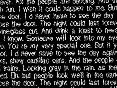
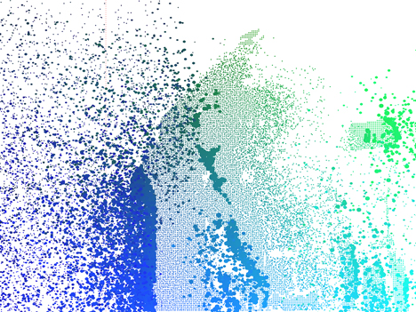
tFont
Please introduce your original typefaces “tFont” and “fTime”.
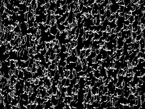
Both typefaces are generated from a theme based on graphic and time. The “tFont” is named with a meaning as Font with time axis (t). Dots of light arranged in seemingly random patterns describe in fact the shapes of letters that can only be read when photographed with long exposure. And “fTime” is generated as a pair of “tFont”. According to the way to the idea of “tFont”, “fTime” will be the time axis (Time) with font (f), which can be explained as an image of alphabets (A-Z) arranged on a certain temporal axis. In other words, this is a player of fonts like playing music and films.
You have created various interactive works so far. How come you focused on typefaces?
Originally, interactivity and typefaces were very much the mainstay of my interest. The reason why the two are linked together is that we started with the idea that it might be possible to express something that cannot be achieved with a classical graphic, by making a graphic based on the web rules to optimized to the web. The first one was “tFont”.
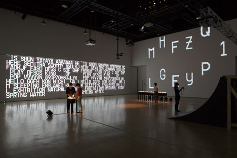
Semitra Exhibition “tFont/fTime” (Yamaguchi Center for Arts and Media [YCAM], 2009)
Your interactive works are explored mainly through both installation and the web. What do you like to try using for different spaces?
We want to create something that is realized by inspiring installation (actual space) and web each other. But we keep in mind not to leave behind the subject.
How do you proceed making works? Could you share a little about your work process? Does each member have their own duties?
The process depends on projects. As for “tFont” for example, I proposed a program sketch and we shared it with members. For “fTime”, I explained the idea mostly by verbally and each member interpreted on their own and we put them into one.
With the diversity of media, technologies and ideas that are necessary to design are changing constantly. What do you think will be expected or needed for the field of creatives and design in the current society?
It is necessary to deal with the change of media sensitively, but I don’t think it’s enough to do it just scraping the surface of the change. It is necessary to provide an unimaginable possibilities.
Could you talk about the cover design you made for SHIFT? (The cover will be updated on October 1st.)
It is a film work using a part of “fTime” which is exhibited at YCAM. I think you will have better idea what I mean by playing typefaces.
What works would you like to make in the future?
I want to make an interactive work that is not expected to be an interaction.
What’s your upcoming plan?
Nothing in particular, but I want to have a tour of “tFont/fTime” which is exhibited at YCAM.
Semitra Exhibition “tFont/fTime”
Date: September 19th, 2009 – January 10th, 2010
Open: 10:00 – 19:00 (Closed on Tuesdays)
*Please note that this exhibition will be temporarily closed between October 26th and November 6th.
Place: Yamaguchi Center for Arts and Media [YCAM]
Address: 7-7 Nakazono-cho, Yamaguchi
Tel: +81 (0)83 901 2222
Admission Free
https://semitra.ycam.jp
Text: Mariko Takei


