
TARO URYU
PEOPLEText: Ayumi Yakura

Illustration for Shiseido’s “HANATSUBAKI”, 2016
You currently provide the illustrations for Naruyoshi Kikuchi’s column on Shiseido’s “HANATSUBAKI” website. Those women with their unique qualities, do you draw them after reading the column?
I start after receiving the text. I am very conscious of Shiseido’s corporate message “This Moment. This Life. Beautifully.” — which I like very much — and I especially try to express the fleeting moment of beauty for the characters in the text.
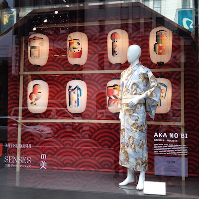
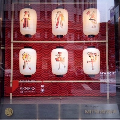
“JAPAN SENSES — Aka no Bi (beauty of red)”, 2016, Ginza Mitsukoshi
What were you imagining when you worked on the “JAPAN SENSES — Aka no Bi (beauty of red)” window display for the Ginza Mitsukoshi department store? Was it your idea to draw on the chochin (Japanese lanterns) in the display?
This is a window display series that changes every season. It aims to express the Japanese sensibility. For the summer of 2016, it had already been decided that Chochin, the color red, and Matsuri (festivals) would be used.
“JAPAN SENSES — Aka no Bi (beauty of red)”, 2016, Ginza Mitsukoshi
The two windows I was in charge of were split into a window full of large lanterns and one full of small lanterns. I considered visibility and reproducibility, and decided to draw simple items depicting “festivals from the past to the present” on the smaller lanterns and fashionable figures representing “festivals of the future” on the larger ones.
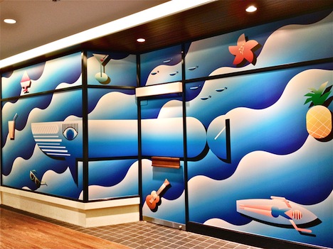
Artwork for “OMOTESANDO HILLS JOURNAL No.7”, 2015, Omotesando Hills
Can you talk a bit about the seasonal visuals you did for the Omotesando Hills shopping complex? They were full of the usual summer themes, but your illustrations had a very refreshing take on them.
The art director requested that I “illustrate the beach without using human figures.” I knew that if I could use a sophisticated graphic style, the most generic summer themes could be expressed in an interesting way. But simple representations can also appear comical and childlike, so in order to give a slick look, I used gradations — which I hardly used at the time — and emphasized the sharpness of the images by not outlining them.
Read more ...


