SUPERMUNDANE
PEOPLEText: Naoko Fukushi
I feel the taste of Art Nouveau in your font design. Did you actually try to do it?
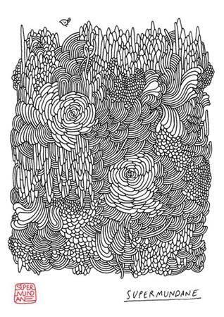
I can see what you mean but it wasn’t a conscious decision. Almost all my fonts start as some sort of a sketch, I love organic letterforms and their highly decorative elements, I guess there’s a link to Art Nouveau there.

What’s your roots? (It can be anything, people, book, music, etc…)
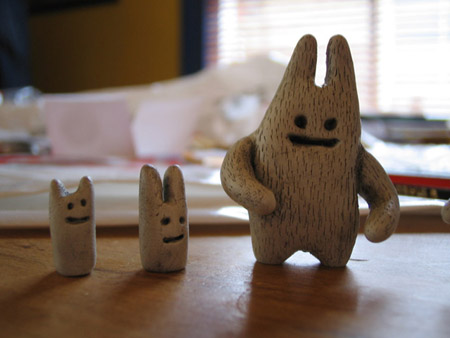
When I was a lot younger than I am now I used to be into calligraphy, which started my love affair with type, I was also in to fantasy art and miniatures along with heavy metal music ( I was a bit on a loner as a child ) I have only just started to appreciate how these things have influenced my work up to this point. I tried for so long to move away from my past but now I can see the logos of the heavy metal bands I used to like in my type and the fantasy elements are there as well in the form of beasts I draw and make and doodled worlds.

Do you imply some special meaning in your name “Supermundane”?
The word supermundane is a real word that is in the Oxford English Dictionary. I found it whilst working in my first job as a graphic design in a kettle factory in the Midlands here in England. It means ‘beyond earthly things’, I really liked the fact that it sounds the opposite to it’s real meaning.
You are going to hold your first exhibition in London. How is it going to be?
I’m really excited about it and quite nervous. It’s been a lot of work but has been really fun. I’m hoping people will enjoy it and it will make them happy. I have the private view on the 30th November which, if nothing else, will be a good party.
Could you tell us about London graphic/design scene? Is there a new movement that should be focused on?
I don’t really belong to a London scene and I’m not really sure what is going on in terms of movements. Maybe this will change. I have always felt more affinity with the West Coast scene in America, their sentiments and style seem to be more suited to my own.

Please tell the concept of the cover design this month of Shift?
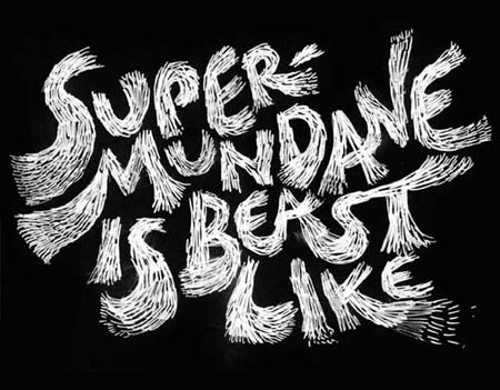
The beasts, for once, are happy and in celebration of shift have made themselves into the letters to form the word.
Is there any plan or anything you want challenge from now on?
As I mentioned early, I’m art directing a new magazine that has to be finished by the end of the year so that’s my main project. Apart from that there’s plans in the pipeline to do more Supermundane applied arts such as plates, cushion or anything useful that I can adapt myself to.
Text: Naoko Fukushi


