STUDY O PORTABLE
PEOPLEText: Joanna Kawecki
Study O Portable is an interdisciplinary design duo based in London, established in 2009 comprised of forward-thinkers Bernadette Deddens and Tetsuo Mukai.
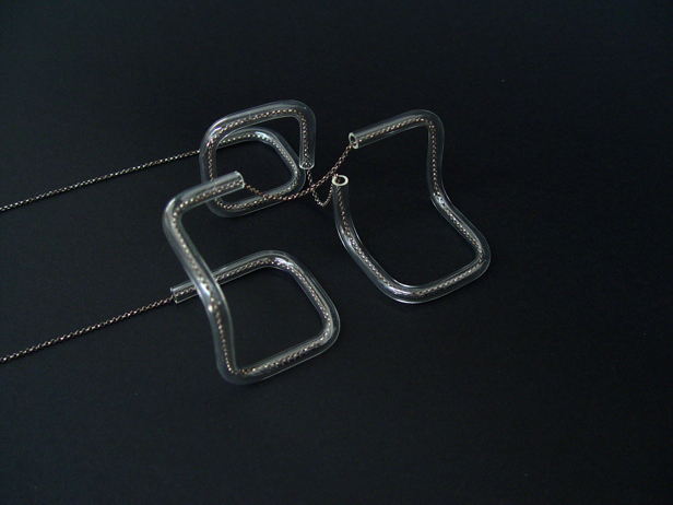
They are a design practice for accessories and other small objects, their humble demeanour directing focus on their intelligent creations. With an immense amount of research involved, the creations are comprehensive and bordering brilliance of consideration to spacial, religious, historical, and ethical reference.
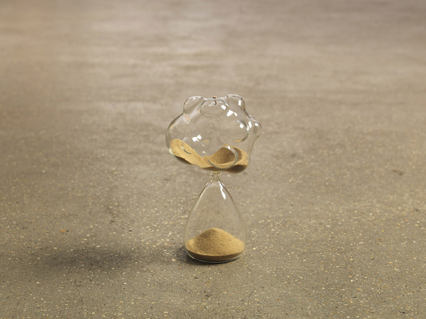
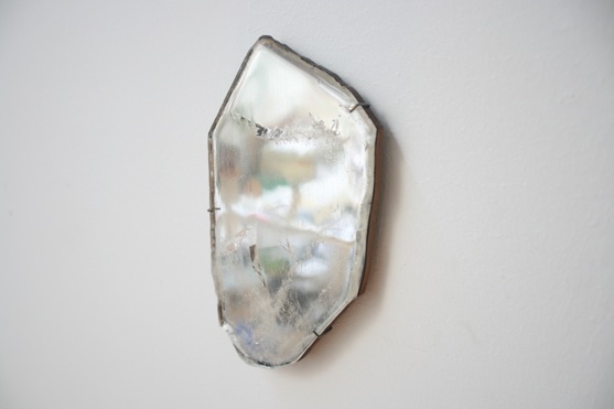
You could describe their creations as lifestyle products with a difference, they are thought-provoking yet pragmatic. “Quartz Mirror’, an organic mirror made of quartz, or ‘Sandglass’, a unconventional hourglass depicting the true unpredictable passing of time.
The couple is one of a kind, curating and coordinating regular group exhibitions with like-minded emerging and groundbreaking creatives locally and internationally, showing at Design Miami, London Design Festival and Salone del Mobile in Milan just to name a few.
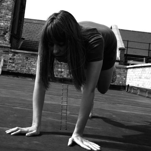
© Virginie Litzler
What are your backgrounds from home, life and study?
We both studied at ArtEz in Arnhem, the Netherlands, Bernadette 3D Design and Tetsuo Fashion Design. Bernadette went on to RCA to do MA Design Products while Tetsuo worked in the fashion industry for a couple of years, before forming Study O Portable together.
One of us is from the Netherlands and the other one is from Japan.
You have a wonderful creative partnership together, both in work and in life. How did your Study O Portable partnership begin, and how did the idea begin?
Initially the idea came about when we were talking about living in London, a place we’re not native to and a rather transitional city, how we’d like to be able to live and work anywhere. When we started the focus was on portable things such as jewellery and accessories. We expanded these ideas by discussing portable or transferable ideas, we got a bigger space, works became larger in scale as well. In terms of ideas and subjects, we have mutual interests and similar design ethics, we complement each other in our methods and skills.
© Study O Portable
Why was the name Study O Portable selected?
We were interested in the idea of portability, both in things and in ideas, and also the idea of studying, learning things as we go along. Curiosity is one of the main reasons why we do the kind of things we do, and the word study seemed to stand somewhere between this notion of curiosity and execution of ideas (as in studio).
©StudyOPortable
You work very knowledgeably with natural materials such as stones and colour, and incorporate intelligent research to your concepts such as religion and history. How important is research to your projects?
We do enjoy the research part of our projects a lot! We try to establish new or unseen relationships between fact, fiction, materials and objects, fitting within a culture of arts and science. Through research, we also learn things that might not relate directly to the project at hand but would inform later projects, or give us ideas we later work on.
© Study O Portable
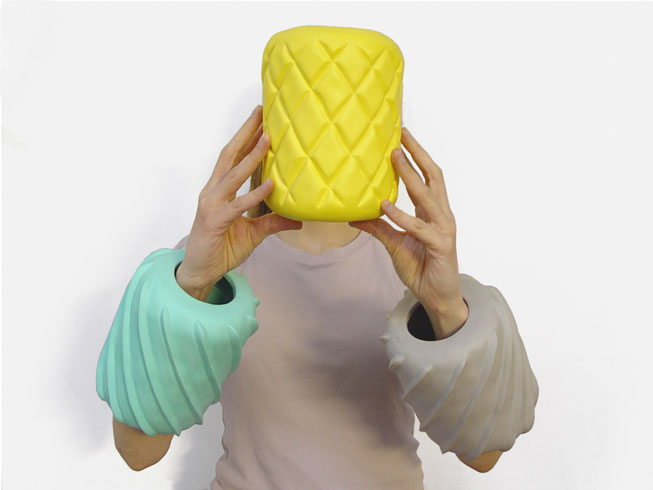
What new materials are you currently working and exploring with?
We are currently working with natural industrial diamonds, a few months ago we visited a company that deals in industrial diamonds for abrasive and drilling applications. These stones have such a powerful natural beauty, they come in unexpected forms and colours and they represent some unimaginable force of nature, it’s odd they’re not commonly used for ornamental purposes.
© Study O Portable
Please tell us about Image for a Title: Placebo Effects in the Cultural Landscape, the latest exhibition that you recently curated in London.
For the last three years, every September during London Design Festival, we organised group exhibitions with themes that we were interested in at the time. We ask around five people to participate in the show, presenting a work as a reaction to the theme we set. Image for a Title was the exhibition we did last year (2012), and as the rest of the title suggests, it’s about placebo effects in the cultural landscape, in the things we use everyday and ideas we take for granted.
The exhibition presented five works, including ours, from artists, designers and an architect. We also produced an accompanying booklet with contributions from artists and writers.
We enjoy doing these exhibitions and they also give us an opportunity to contact and work with people whose work we like, and learn something new. It’s always very interesting to see how other people react to the same theme.
© Study O Portable
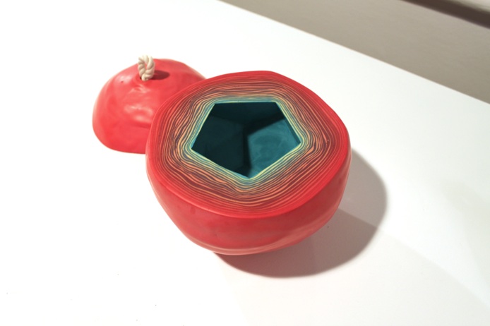
Please also tell us about your installation RGB that was involved in the exhibition.
We were interested in how our beliefs in objects sometimes supersedes the physical quality of them.
The colours produced through natural minerals have two qualities; they are natural materials that physically affect the environment, our bodies etc., but at the same time, the colours produced by them have another, often ritualistic qualities to them. For example green is a calming colour, even if its made from the toxic substance.
They are also considered holy or sacred in various religions and used in paintings and decoration to signify certain qualities and meanings. We saw a similarity in all this with our modern belief system largely maintained by media distribution, through screens and displays.
It seems we take things on TV and computers more seriously sometimes, or they become more believable because of they state, the colours magically appearing in the flat surface in front of us, much like the realistically and beautifully painted triptychs in churches and cathedrals. RGB is a set of room dividers made with glass and natural pigments, all of which historically had cultural and/or religious significance. The colours/pigments, Cinnabar, Malachite, Azurite, depict the colours of RGB, a modern triptych we see and use everyday
Text: Joanna Kawecki


