
NOZOMI WATANABE
PEOPLEText: Mariko Takei
An artist who approaches to space with imagination from materials.
Jet black in the Japanese letter uses 2 characters: one means black and the other means lacquer (Urushi). Using lacquer as the material, Nozomi Watanabe is an urushi formative artist who creates the world of jet black. She utilizes glossy lacquer to mirror the surrounding world on the glassy surface, and blurs boundaries between inside and outside. SHIFT looks into inside world of her creation.
I heard you came back to Sapporo, your hometown 2 years ago.
I went to the university and graduate school in Yamagata for 6 years. And after the graduation, I lived in Aomori for 2 years and then came back to Sapporo. Aomori is a town of craftsman. Because of that, many people have love towards the local area to nurture young generation. As I was looking to such style, I felt the need to cherish the local. With an idea that I wanted to let the local know my work, I decided to hold my first solo exhibition in Sapporo, the same place where I did my final thesis presentation at the high school in 2008.
When did you start to get interested in art?
It’s from my childhood. My mother used to go sketching events every year, and I went together to sketch. Originally I was very shy and liked to draw most of my time. So I felt happy when I had new friends through my drawings.
During my high school years I was into art, mostly drawing and pottery. As I wanted to continue to learn art after the high school, I decided to go to art university. But there were no such school in Sapporo at that time, so I took an exam, passed it, and became a student at Tohoku University of Art and Design in Yamagata, which is the closest art university from Sapporo.
How did you get to know about lacquer?
Although I was majoring in the craft course to lean pottery at the university, I had more selections to choose from metal, dying, craft, and lacquer. As a freshman we needed to learn all anyway. Then, I came to know that lacquer is not just about lacquerware, it creates a form of “kanshitsu” (dry lacquer substance). I was scared of getting poison ivy, but was more intrigued by urushi.
My work is made with a basic form using hemp cloth and lacquer. I was quite interested in the process that lacquer itself makes a form, it’s not just used as a painting material. In the process , I paste hemp cloth onto the plaster mold in layers, and later taking off the piece from mold. After taking the mold, I often find something unintentional inside, which is very interesting for me. These are other reasons I decided to work on lacquer.
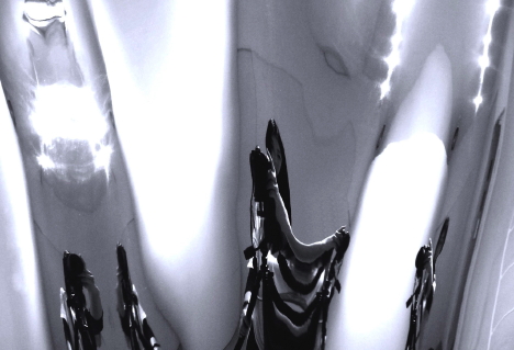
“MASK” (2010) at Hokkaido Three Dimensional Art ’10
You exhibited your new piece for a group exhibition, the Hokkaido Three Dimensional Art ’10, which was held at the Hokkaido Museum of Modern Art until June 6.
The new work is “MASK” (2010), which was a quite big piece that has about 4 meters in width. I displayed it by the window, so it had 2 different look on the surface during day and night. At the daytime when it’s sunny, greens in the garden can be seen through the window and mirrored onto the glossy black surface clearly. At night, I lit a bit on the back of the piece using the reflecting light of the white wall. I saw the piece in blue at night.
I use a traditional technique of lacquer called “kanshitsu”, which uses hemp cloth, urushi sap and powder. In the kanshitsu technique, hemp cloth is pasted onto the plaster-made mold in layers, with a glue of lacquer, mixture of earth and lacquer. The technique came about to make buddha statue in the Nara period (710-794) in Japan. Compare to wooden statue, you can do details with the kanshitsu technique, which is also very light in weight.
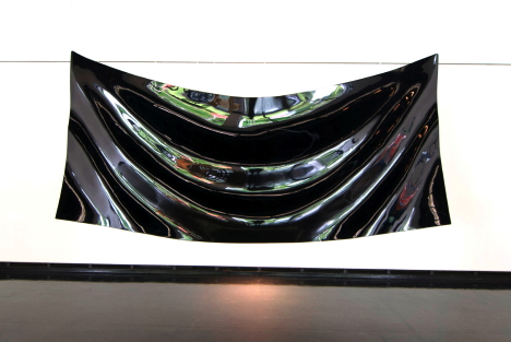
“Slow rain” (2007)
Another traditional technique I use is “Tsugaru-nuri”, which I have learnt in Aomori. “Slow rain” (2007) is a piece made with one of the Tsugaru-nuri tequnique called “Monsha”. I arranged the Monsha-nuri technique by using powder of charred rice chaff. Since the rice chaff is natural material, each grain of the powder has a different form like square, triangular, rectangular, and so on. And each particle creates irregular reflection. This Monsha-nuri technique was used to draw “Kamon” (family emblem) in the Edo period (1603-1868). While Tsugaru-nuri is famous for the ocellated pattern, I made this piece to offer an opportunity to feel closer in the contemporary way. I made the piece during my training period under the Tsugaru-nuri artisan.
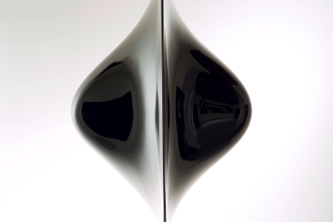
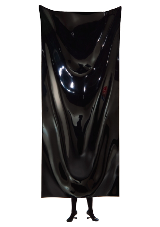
“Humpty Dumpty” (2008)
You make your artwork under the concept approaching to space with imagination from lacquer. How do you approach?
It’s not only materials. I’m into the progress as well. In earlier times when people had no ceramics and when people used lacquerware, people discovered various features of lacquer, used it as glue or painted it on tableware. Through my pieces I want more people to know the power of the material, which has been used in the daily life.
I make black lacquer by adding iron, instead of pigment. There is no other way to make such a glossy deep black. I choose how I want to finish the surface such as glossy or matt. In case of gloss, it blurs boundaries between the shape of a piece and the surrounding space. The piece is painted with lacquer over again, and it will create deepness inside, which appears outside spontaneously.
“Humpty Dumpty” (2008) is a good example of it. There seems no boundaries between the piece and space, because the mirrored surface reflects each other. The boundaries seem too blurred. So if you want to tough it, you cannot find the surface. As you touch, you cannot reach it, and visa a vasa. It create an illusional effect. By taking an advantage of the material, I make works under a theme to overlap it on my concept.
Also, it seems there is another deep world inside of the piece. I make big pieces, but it’s not that I want to do so. I make with that style, because I want people to imagine how they are drawn into the glossy lacquer. It’s like you cannot actually see inside, but you can feel there seems something. If I make lacquerware, people would be aware of it too much.
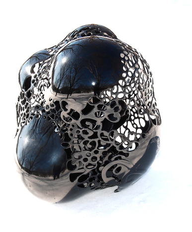
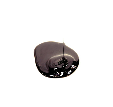
“secret” (2004)
You are interested in dual nature such as inside and outside.
First, I want viewers to have a sense as they wonder if there’s boundaries, if there’s something inside, or if they would wander inside. I try making it in one of the fretwork design piece “secret” (2004). This piece was shot on the snow, and it mirrors sky on the glossy lacquer. I am interested how this piece create people to look inside spontaneously since there’s fretwork, like an window, on the surface of a 3D piece.
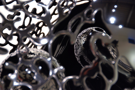
“secret” (2004), detail
If you look inside the piece “secret”, there you can find 3 spherical objects. If you carefully look inside, you will see the reflection of the fretwork mirrored onto the surface of spherical objects. I make fretwork design pieces and non-fretwork ones. Basically I make both under the same concept.
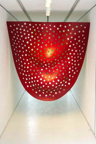
“Drothy” (2005) / “NOZOMI WATANABE EXHIBITION” Project exhibition at GALLERY MONMA ANNEX
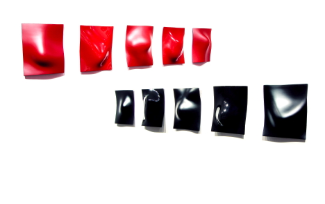
You particularly use 2 colors, black and red. Why?
Black is a color I could be empty and also people can see it as they don’t be bothered with colors. It’s impossible to make such black without lacquer’s chemical reaction to iron.
Red is something relating to religious things like festivals, funerals, and torii (traditional Japanese gate), which are something supernatural and magical. I also think it is a color that encourages people, gives an excitement. So I use red when I want to make something symbolic. The piece “Drothy” (2005)exhibited at GALLERY MONMA ANNEX in Sapporo was created exclusively for the gallery space. For this piece, I used red with no gloss. It has an image of a “gate”, as it attract people’s attention to look into the green outside.
On red pieces, I don’t pursue an expression to look like a mirror. I use red pigment, so impurities are included into the lacquer. It gets vivid color, but it’s something different from the deepness created in black.
“a woman’s feelings” (2009)
The “a woman’s feelings” (2009) is a series of 2 different ranges of plates with black and red finished in matte and gloss. In the matte finish pieces, they show reflections of natural light. In the matte, on the other hand, they focus on reflection of people in front of the piece. Each piece has a bulge on the plate, which will look like a different shape every time you see it depending on which direction sun shines. It’s like a woman.
“skin” (2005)
What is your inspiration sources?
For “skin” (2005), for example, it’s a curtain as I want to harden a natural thing into a shape. I feel beautiful in the wavy drapery, and want to harden it. I also like clothing people wearing without human body. I like the shape of it. I find interests in such things.
How would you like to explore in the future?
I want to exhibit in the darkness, with a little bit of light, showing an installation spread flowers on the floor to change how my work would look like.
I also would like to do expressions of decay. I feel beauty in flowers to decay. Lacquer gets deteriorated under ultraviolet rays, and it gets opaque. Lacquer is resistant to acidity and alkaline, but ultraviolet rays. It is a natural condition to return to soil. I want to utilize it doing installation.
What’s your next plans?
I will work on 7 exhibitions this fall, one is an exhibition in a museum in Shanghai in the begging of September, and another one is a group exhibition of the Japanese lacquer formative artists at the art festival in Aizu in October among other exhibitions in Canada, Sapporo, and London and New York in the next year.
Text: Mariko Takei


