
MIN WANG
In the summer of 2008, the eyes of the world will turn to Beijing, China as the city becomes host to the spectacle that will be the Games of the XXIX Olympiad. Hosting the Summer Games will be one of many firsts for the fastest growing nation in the world. One of the leading programs in China’s debut at center stage of global tourism and sports is the development of the Beijing Games pictographic symbols, identity program and applications. Designer Min Wang is the creative force behind this extraordinary undertaking which began three years ago in a country that just 30 years ago had no word for graphic design.
Min Wang is the Design Director for the Beijing 2008 Olympic Games, a position to which he was appointed in 2006. Since 2003, he has also been Dean of the School of Design, at China Central Academy of Fine Arts (CAFA) in Beijing. At that time, he created a unique working group in the Art Research Centre for the Olympic Games (ARCOG) at the China Central Academy of Fine Arts. Under his leadership, the Centre’s design teams, including CAFA students, have developed an elegant and comprehensive design system for the Beijing 2008 Olympic Games. Their work includes the athletic pictographic symbols, the Beijing Games Emblem, and its applications. All of these efforts address design planning through the development of extensive design standards manuals for the Beijing 2008 Olympics, and reaffirm the Olympic spirit and significance of this international multi-sporting event.
Wang’s efforts, and those of his design teams at the Art Research Centre, follow in the tradition of Olympic pictogram designs developed by art director Masaru Katzumie, who invented the first system of pictograms for the 1964 Tokyo Olympics. Katzumie, working with his graphic design team, was concerned with the social importance of graphic design and focused his research efforts on an internationally standardized signage system. (*1) Their unique system of icon-based signage became the model that influenced Lance Wyman for the 1968 Mexico City Olympics, and Otl Aicher for the 1972 Munich Olympics. A noteworthy event occurred in 1966 when Aicher met with Katsumie and collaborated on underlying design standards and a more streamlined pictogram design based on the 1964 Tokyo Olympic pictograms. The Olympic wayfinding efforts since Katzumie have also become landmarks in the advancement of design systems for major international events and universal public visual design systems. (*2)
The Beijing Olympics and the spirit the Chinese government hopes to create are not without controversy. Few Olympic Games, since 1936 when Jesse Owens won four track and field gold medals in front of an irate audience of Third Reich leaders, have been free of socio-political issues. In the United States, at least, the atmosphere has already been heated by articles on China’s human rights record and its investments in Africa, to name a few issues. At stake for the Chinese in 2008 is nothing less than the opportunity to be perceived a full-fledged member of the world community. To that end, China has invested heavily in the games and its identity—from architecture to graphic design—and surrounded it all with sophisticated public relations.
The Olympics design program has been developed in a relatively new design education environment and business environment, as China rapidly expands and begins to blend Western design with its 5,000 year-old artistic traditions.
The designs of the Olympic Emblem and its applications, athletic pictograms and Olympic color scheme standards are elegantly presented in three large format, white, perfect bound design standard manuals: Beijing 2008 Olympic Games Emblem Usage Manual, Pictograms of the Beijing 2008 Olympic Games and Dancing Colours: Beijing 2008 Olympic Games, The Colours. The design and writing, created by ARCOG teams, is the equal of any multinational corporate branding effort in the West. Each manual elaborately presents a facet of the standards management process. In the Usage Manual under a positioning statement entitled “Core Design Concept of the Beijing 2008 Olympic Games Emblem” the Olympic Emblem is named “Dancing Beijing” and is declared to be “the seal of the nation”, “the signature of Beijing” and “the spirit of the individual.” In conclusion they state ”Dancing Beijing is an invitation—a hand extended to welcome the world to China for a celebration destined to unite humanity as never before.”
Min Wang arrived at Yale University in 1986 after studying at the Yale Summer Program in Brissago, Switzerland in 1985 under graphic designer Armin Hoffman and industrial designer Richard Sapper, and after completing his art education at Zhejiang Academy of Fine Arts (now the China Academy of Fine Arts). While a student at Yale University Wang attained a pivotal design position at Adobe Systems in late 1986 just as the digital revolution came to the desktop with the introduction of the first-generation Macintosh computer. Wang, along with fellow graduate student Brian Wu, had the task of digitizing Kanji typefaces (Japanese fonts) using a beta version of Adobe Illustrator on the first generation Macintosh computer.
Shortly after graduating, Wang joined the faculty of the Yale University graduate graphic design program where he taught a typographic workshop. He joined a graphic design studio in New Haven, Connecticut, and continued in his many roles as Graphic Designer, Senior Art Director and Design Manager in the Creative Services division at Adobe Systems. In 1998, Wang left Adobe to form Square Two Design with design partner Eddie Lee, establishing offices in San Francisco and Beijing. Square Two Design clients include Adobe, IBM, Intel, Netscape, and Stanford University.
Wang’s work at Adobe and Square Two Design illustrates the influences of his Eastern and Western design education and his fusion of elements of contemporary Western design and traditional Chinese arts. For example, his typeface Mythos, based on legendary mythological beasts from Eastern and Western cultures, includes both the unicorn, with predominately Western roots, and the dragon, originating in East Asia, both united within the Roman letterforms. Other examples include his logo design for the US & Korea Trade Association, where he merged the stars and stripes of the American flag with the Taegeuk symbol of the South Korean flag, as well as the Adobe Stone calendars, where he integrated Roman letterforms into the design reminiscent of a textural Chinese brush painting. Some of Wang’s work, such as his Bird House logo, a bird symbol merged into the counter of a Roman letterform are reminiscent of his Western education, while other designs, such as the freehand calligraphy on his Forbidden City t-shirts appear entirely Eastern.
Wang has been a visiting fellow in Germany at Akademe der Bildenden Kunste, Munich and Hochschule der Kunste, Berlin, and was appointed Honorary Professor by Shanghai University, Fine Art College. Wang’s work has been exhibited internationally in showcases such as the Biennial of Graphic Design, Brno; the Graphic Design Show in Beijing; the Type Directors Club Exhibition in New York; the International Poster Biennial, Lahti; the collection of Museum für Kunst und Gewerbe in Hamburg and the Museum für Gestaltung Zürich.
(*1) Graphic Design A Concise History by Richard Hollis, Thames and Hudson Ltd., 1994
(*2) Otl Aicher by Markus Rathgeb, Phaidon Press, 2006
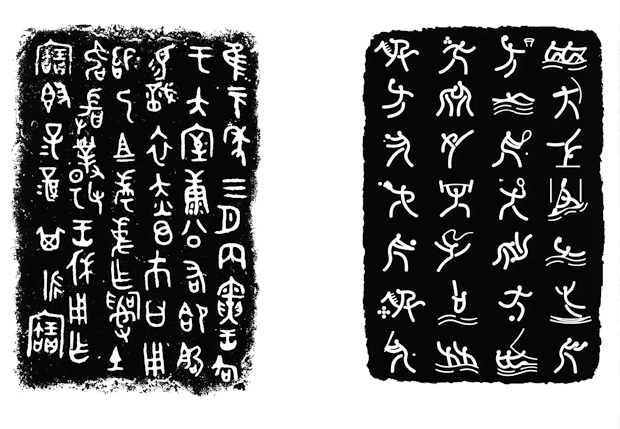
Left: Inscriptions on the Gui bronze vessels, Right: Pictograms of the Beijing 2008 Olympic Games
What is the nature of your leadership role as Director of Image, Identity and Design for the Beijing 2008 Olympic Games and the iconic identities that you designed or art directed for the 2008 Olympics?
In October 2006, I became the Design Director of Beijing 2008 Olympic Games. My responsibility covers overseeing the image and identity program and the look of the game from the present all the way through the Olympic Games in the summer of 2008.
I became involved with the Beijing Olympics as early as 2001 when I was invited by the Beijing Olympic Bid Committee to design the Bid Presentation at the IOC meeting at Moscow. Beijing won the bid. Then in 2003, I was invited by BOCOG (Beijing Organizing Committee for the Games of the XXIX Olympiad) as their expert on image and identity. Meanwhile, I took an offer as the Dean of the School of Design at the China Central Academy of Fine Arts (CAFA) and moved back to China after spending over 20 years in Germany and the United States. The first thing I did at CAFA was to start the Art Research Centre for Olympic Games (ARCOG), which has served as the core team for coming up with many major Olympic designs. Here is a partial list:
Identity Guidelines / Color System / Pictograms
Medal / Emblem of Paralympics / Way-finding System
The Core Graphic / The Look for the Torch Relay
The Looks of the Game Guide
The Centre now has 20 full-time designers plus faculty and students who are actively involved with different design teams and projects. There are many design studios and ad agencies working on Olympic related projects. The design work I mentioned above is based on teamwork, and I feel very fortunate to be able to lead such a strong team for the last 3 years.
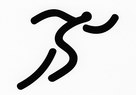
Athletics Pictogram
How did you design the Olympic symbols and identity while straddling the line between West and East? What were the Olympic Committee’s impressions of your designs?
Yes, all through the design process, we are walking along and across the lines between East and West. It is a great challenge for Chinese artists and graphic designers to successfully use the 2008 Beijing Olympic Games to make a statement to the world, by understanding the “global” needs and spirit, promoting that spirit in an artistic language, which will inspire both the local and the international community. To create a new look of the city that will bring the world into China and to bring China into the world. Therefore, in the design process, we have to constantly ask and solve these questions:
How can we create a look that combines the Olympic spirit and Chinese values?
How can we create a look that blends the traditional with the contemporary?
How can we create a look that is uniquely Chinese in color and form?
How can we create a look that touches hearts and minds of the people from all over the world?
Let me give two examples of design solutions we found:
First, the pictograms of the 2008 Olympic Games. We knew from the very beginning that our challenge was to create the pictograms in a visual language known to all world athletes and spectators, and at the same time uniquely Chinese. We came up with quite a few good design concepts and went through many internal reviews and selections as well as external competitions with other design institutions. Finally, we decided on the current best solution.
Let’s take a closer look at the original inspirations behind the creation of the pictograms. The pictograms use the structure of the Chinese seal script as the basic form, while incorporating the charm of the oracle bone writing and the bronze ware script from over 2000 years ago. We also used the rubbing form for the pictograms. The extraordinary form and force of expression of the rubbings have made it a distinct form of traditional Chinese art.
Nevertheless, the overall look of each pictogram is also very modern and international. This effect is achieved by fine touch of lines, shapes, curves, black and white contrast, and flowing motion of the sports–all elements of modern and western design. Thus, in this case, we successfully created an image that is not only uniquely Chinese, but simple, clear, and aesthetically appealing to a world audience.
Another good example is the Olympic Medal design. The inspiration of the design comes from China’s ancient jade, knows as “bi.” In ancient China, people wore Jade as a decoration to symbolize nobility and honor. This cultural tradition continues today, people wore jade to wish for good health and luck, and to symbolize virtue and aesthetic value. The inspiration of the medal hook also derives from jade “huang”, a ceremonial jade piece with a double dragon pattern, often used as a hook to tie strings on.
On the medal’s front side, we have to follow the standard design patterns and inscriptions required by the International Olympic Committee (IOC), while on the back we add the Chinese element, an inlaid piece of Jade in a ring shape, with the emblem of Beijing 2008 engraved in the center. Jade and gold, symbolize honor and achievement and are the perfect embodiment of traditional Chinese values and virtues. When I presented the idea of adding jade to the medal design, the IOC responded very positively:
“Noble and elegant, the Beijing Olympic Games medal is a blending of traditional Chinese culture and the Olympic Games. It gives the winners of the Games great honor and acclamation as recognition of their achievement.” (quote from BOCOG website)
Read more ...


