MIN WANG
The American ex-patriot Henry Steiner, also educated at Yale University, seems to have had a wide influence on the graphic arts in China. Your impressions of his work and influence?
He can be credited as the most influential figure in the early days of Hong Kong’s graphic design that took off in the 1960s. In the 1980s, the Hong Kong designers brought that influence to mainland China. Being an ex-patriot designer in Hong Kong, Steiner’s design work has to constantly deal with cross-cultural or inter-cultural themes. As a result he published an excellent book, titled “Cross-Cultural Design: Communicating in the Global Marketplace” in 1995. I really admire Henry’s design work as well as his contribution in researching and writing on cross-cultural design that has influenced a younger generation of Chinese designers.


Bird House Logo / US Korea Trade Logo / Eaton Food Logo
What are your thoughts about identity and iconic design across cultures and how has that informed your work?
Cross-cultural design requires an extremely sensitive understanding of different cultures at a deeper level. Just adding a few Chinese characters to a work cannot necessarily elicit resonance in the Chinese people. Similarly, to add some English words on the package won’t guarantee the sales of a product in the American market.
It is a precondition of cross-cultural design that designers have a profound knowledge of cultures on both sides. It was my years-long experience in identity and branding design in the West and keen understanding of the Western culture and audience that led the Beijing 2008 Olympic Games Bid Committee to ask me to lead the design effort for Beijing’s Olympic bid presentation in 2001 and now to work on the image and identity for the Games in 2008. To facilitate the understanding and acceptance of our design by a Western audience, we resorted to Western-style visual language and techniques. Our design is deeply rooted in the Chinese culture and reveals strong Chinese messages.
Do you agree that the font Mythos that you designed in 1993, while at Adobe, composed of legendary beasts from different cultures, draws similarities to the graphic identity for the Forbidden City?
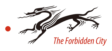
The two are not exactly same. The graphic identity that I did for the Forbidden City was based on an earlier Han style dragon from tile stone rubbings. The beasts in Mythos were based on classic European figures, but I may unconsciously have added an Asian touch to it that I was not aware at the time.
It’s very natural for me to choose the image of a dragon. In Imperial times, the dragon was the emblem of the Emperor. And even till today, the dragon is also regarded as the symbol of the Chinese nation, and people will always find spiritual sustenance in it. Dragons are depicted in various patterns in the Forbidden City. However, the overly elaborate dragons in Ming and Qing-dynasty-style suggest a hint of vulgarness. I therefore chose the Han-styled dragons instead.

The Forbidden City Logo
The graphic identity you developed for the Forbidden City integrates traditional Chinese arts and crafts forms into a contemporary visual language. Can you talk in depth about the development of this identity and problems you faced during the execution phase?
Yes, the identity design for the Forbidden City clearly reflects my conscious effort to bring the elegant Han Dragon alive to the modern world. Considering the audience can be both Chinese and international, I wanted to add a contemporary touch to it. I was doing the Mythos type design for Adobe type library not long ago and it was quite possible that I could have unconsciously added that European flare to the Chinese dragon.

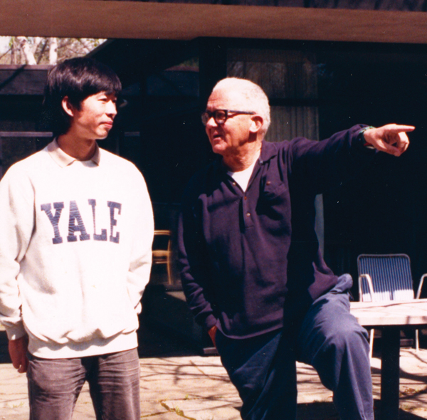
Paul Rand and Min Wang
What were your student days like at Yale University? What were your impressions of Paul Rand, Armin Hofmann and Bradbury Thompson?
I was a graduate student at Yale University in the late 1980s and feel very fortunate to study graphic design under these three great masters, who had very different teaching styles and approaches. Paul Rand was quick and sharp; Brad Thompson was genteel and patient; and Armin Hofmann was always witty and wise. I learned a lot from them not just how to do good design, but also how to think about design and be a good design educator.
How has your educational training in Europe and the United States shaped your design language?
Who we are and what we do is very much determined by our learning experience. In my case, after growing up during China’s Cultural Revolution period and learned how to use color and form first by painting the portrait of Chairman Mao onto a rural village wall, moving on to study design in a Chinese art school, and then to Europe and United States, each learning experience adding to another to shape my design language today. I had a solid training in Western design disciplines and extensive work experience both at Adobe and Square Two Design, but my Chinese cultural sense and sensibility stays with me as who I am and definitely influenced my design today.
What do you see as the mentoring role Alvin Eisenman, director of the Yale University graduate graphic design program played and his typographic advisory role at Adobe?
For over 40 years, Alvin had given all his time, passion, and energetic devotion to the Yale University graduate graphic design program and made it into a world-class educational institution. To me, Alvin is not just a mentor, but also a role model and as an educator, a fatherly figure. I think that my decision to come back to China and teach at CAFA had a lot to do with Alvin’s influence on me. When I visited Alvin in May of this year (2007), it become clear to me that it was his big heart, broad vision, love for typography, passion for teaching, and care for students that made the Yale graphic graduate design program the home for me and for many faculty and students in all those years.
What was your teaching role in the Yale University graduate graphic design program. Did it include using beta version’s of Adobe Illustrator and Adobe Photoshop?
From late 1980s to late 1990s, I taught courses at Yale University graduate graphic design program. My teaching focused on two fields: 1. cross-cultural design and eastern typography and 2. digital image making. In 1989, with colleague Charles Altschul, I taught the image workshop, using Adobe Photoshop which was still a Beta version at the time. Students used Photoshop to make collage, manipulate photos, and came up with many experimental images that were not possible to compose by using traditional tools. In my cross-cultural design and typography course, I taught students to experiment how to incorporate Asian letterforms into their design by using Adobe Illustrator and an early version of the Kanji fonts. For most Yale students, this was their first exposure to Asian typography.
Read more ...


