
COLIN METCALF
PEOPLEText: Rei Inamoto
I’ve been quite fascinated by the overall art direction of Resfest in general (program booklet, festival trailers, type design, etc). What is your design process like? For instance, how did you come to the visual conclusion for Resfest 2000, particularly of the trailer and booklet design?
Traditionally, there’s a window of time at the start of each year when deadlines abate momentarily, and I take that time to experiment and develop a thread. In 1999, I developed a sort of kitschy space-mission theme for Resfest, which I designed and illustrated along a sort of comic-book vibe. I could have probably gotten another year or two out of that, but I wanted to do a 180 for the 2000 identity.
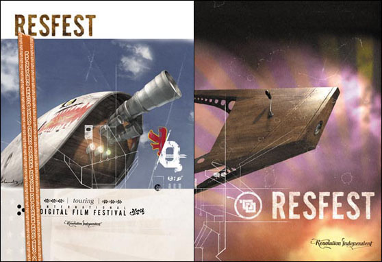
I started playing with a nebulous concept of a parallel universe where things look and feel very familiar, but are not quite right. Creating objects that appear part of a supposed archaeological inventory. Hence the imagery of a mid-19th century wooden satellite, the cross-bred 70mm camera and fighter plane fuselage, and the hybrid American/Japanese flag.
I wrote a fairly detailed narrative of the premise in the form of a book excerpt and a news story, which we never published. I also did a number of very linear pen and ink illustrations reminiscent of arcane circuit maps, stained glass frames or aerial grids. And I built a faceplate to a fictitious machine and photographed it with Jeanne Hilary. The typography had to look both familiar and exotic as well to support the concept. So I developed a bubbly, techno typeface I’d begun a couple years ago called M2K, and created a custom scripted logotype for the tagline "Resolution Independent" that crosses antique and modern.
I also designed an erratic dot-matrix font in which to set cryptic error messages. I generated about 50 different illustrations and images in all, most of which I edited out. The whole process evolved over the period of a few months, in between different deadlines. Ben Radatz (who was instrumental in rendering the 3D versions of the objects used in the campaign), and his company MK12 used the wooden satellite as a centerpiece, and produced an incredibly atmospheric trailer and titles along that direction. They built a massive megalith (virtually, of course) in the shape of an R and managed to insinuate an entire narrative in a matter of seconds.
What do you think about the current state of design?
I’m not sure I have a definite opinion. There’s a lot of scary talent out there, and a lot of fresh work. The stylistic pendulum right now seems to have swung over to the ultra-simple, cyber, almost clinical. I was leaving a gallery with a friend recently, and she asked, “What ever happened to art thats hard to do?” It sort of resonated with me. Her point wasnt that complexity is inherently superior, just that genuine mastery of craft holds little cache anymore. Expedience is the currency of value more often than not.
From a commercial standpoint, its understandable. If your artform is client-driven, chances are you become facile at stylistic impressions. And the trend towards minimalism supports that. Some of that stripped-down design can be really beautiful, but a lot of it just looks vacuous. Flat colors and Helvetica Neue and all that. Reductionism is a finite path.
To take an architectural example, if you knocked 50 stories off of the World Trade Center, its a completely forgettable building. If you knocked half the height off of the Flatiron Building, the level of fascination in detail would still be staggering. The marriage of simplicity and complexity is what interests me. I hear a lot of proponents of “idea-driven” art and design, but that’s only half the battle. A good idea is useless if the execution isn’t at least as good.
Read more ...


