CHILLICHILLY
PEOPLEText: Kyoko Tachibana
For their brand, ChilliChilly, a Hong Kong based product design brand, Arthur Yung and Clement Cheung use narrative form in their design. Having studied architecture, they apply a subtle twist to their design, which gives them a great reputation.
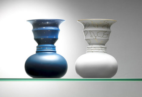
Silhouette Vase
They have recently participated in the Matching Project initiated by SCV (Shizuoka Contents Valley Consortium), to work with a local firm in Shizuoka developing together a design on the theme of “Kids Corner”. We had a chance to interview them and asked about their vision on design and various projects that they have been involved.
Please could you introduce ChilliChilly?
ChilliChilly, a product design brand, started in 2004. Clement and I were the co-founders of the brand. ChilliChilly designs, manufactures household design products such as clocks, tableware, stationary and other living accessories.
Please tell us where the name, ChilliChilly, came from.
CHILLI, CHILLY are homophones; meaning that they have the same pronunciation, but different meaning. What is interesting about this combination of words is that they mean the opposite thing. CHILLI being hot or spicy. While CHILLY means cold. The opposites, or Yin-and-Yan, is something that we envision what ChilliChilly can be – product design that finds the balance of art and practical living.
What are the roles for each of you, and which field are each of you specialised in?
I am mainly responsible for the design of the products and the art direction for the brand. While Clement is the money-man, the guy who deals with the client and the finance of the company. And our colleague, Benjamin Wong is the guy who makes the design into realization, he deals with the production.
Could you introduce us your representative works/projects, please.
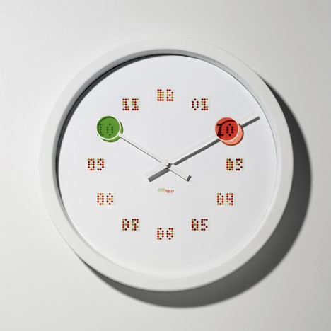
Decode Clock, 2004. Winner of Good Design Award 2004 and Gold Award of HKDA Awards.
When the minute hand crosses over the ‘coded’ words, the readings of time is immediately apparent. so when the minute hand lands on the 12 position, the word ‘twelve’ becomes apparent.
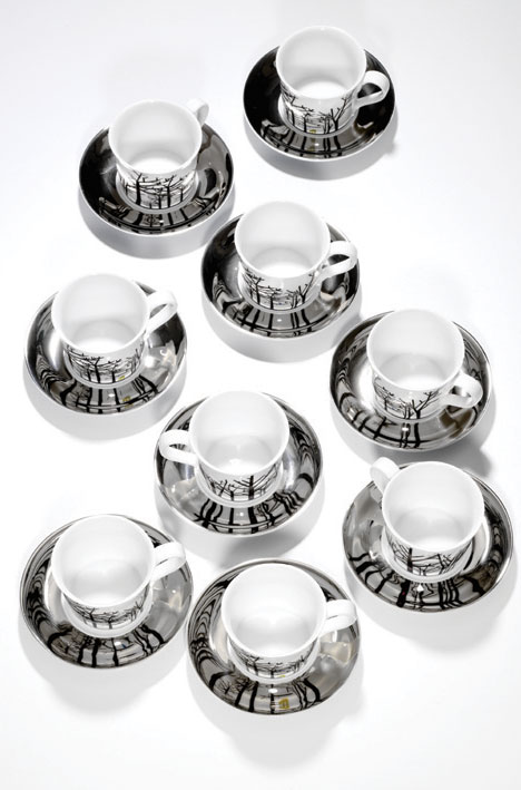
By the Lake cup and saucer, 2004
This was actually our first design. The inspiration came from a trip to Frankfurt; me and Clement were by the canal having coffee, and saw the reflection of buildings off the canal, and we thought it’d be quite romantic to replicate that scene in our design. Of course we romanticized that scene with a minute animal and trees by the lake. So, the reflective saucer was our lake, and when the cup sits on the saucer, the reflective image of the trees are apparent on the saucer.
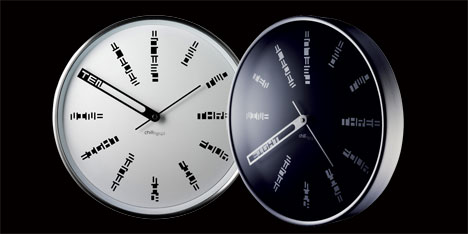
Seeing Doubles clock, 2006. Silver Award of HKDA Awards.
We wanted to have digital readings on our analogue clock. and we achieved that by utilizing the color theory we learn in art-classes. The numbers on the clock differs when the minute hand and hour hand hits the same marker respectively. For example, on the 3 position of the clock, the number is initially not legible; but when the minute hand reaches that spot, it will read “15” (“15” minute being its reading on a digital clock). Alternatively, when the hour hand rests on that space, it will read “3” (“3” o’clock being its digital reading)
Read more ...


