
DUAL CITY SESSIONS: TOKYO AND SINGAPORE
Do you see a particular theme uniting the Singaporean artists and Japanese artists, respectively?
Yeah. These are the original artists that have been in null for the last 3 installments of this project. Its the same as last year. But for the Singaporean artists, my criteria for inviting them was based on the their work and reputation. I wanted artists who were not trendy but rather have a very good sense of subtly in their work. Very strong and subtle, not pop.
So its not a coincidence that everything is in black and white….
Well, there was a brief, and the brief was that we were going to try to keep it monochrome and basically, each of the artists were to choose just two elements to create their artwork. For example, Steve Lawler‘s piece, its a map of Singapore but he used different tones represent the religious make up of the country as a way to form the shape of the island.
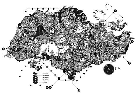
Steve Lawler
Ah I see… So within the exhibition’s theme there is still a lot of diversity…
Yeah, its a good balance between the two groups. Everyone is established and at the same time, doing their own thing independently.
Hanson Ho is a graphic designer and his work sprouted from the two elements of whole lines and shadow, it was really minimal while ND Chow, is a photographer who focuses on human and portrait photography.
Mei, the Analog Girl
And there are musicians too – Mei, the Analog Girl, was here in Tokyo performing a few weeks ago at Cafe Pause.
If you look at the work I contributed, I used a Confucian phrase to show that as a man gets older, into his 30s, 40s and up to 60s and 70s he became wiser. To illustrate that point, I made the Chinese Kanji characters with actual hair which gray as the age increases. If you are familiar with Singaporean politics, Tom Merckx, did a piece on politics and censorship in Singapore.
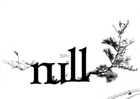
Shun Kawakami
Ok, and what about the Japanese side… I think Shun Kawakami’s typography of the Null logo perfectly sums up the balance of the traditional and the modern- a seriffed font and the bonsai branching extending outward…
Right, you can see that Null artists work to use modern techniques and modern ideas to explore traditional Japanese aesthetics. Takashi Kamada used characters from the Japanese syllabic alphabet and concentrated them into arcs to make a scaling print of concentric circles, suggestive of traditional Japanese calligraphy.
Interesting indeed. Thanks so much Felix Ng for taking time to show us around the exhibit! We are all looking forward to November 27th at the Singapore Design Festival !
Dual City Sessions: Tokyo and Singapore
Date: October 30th – November 4th, 2007
Place: Giuliano Fujiwara
Address: 1F Hoei building, 6-8-18 Minami Aoyama, Minato-ku, Tokyo
Tel: +81 (0)3 5469 5558 (Store)
https://www.dualcitysessions.com
Text: Vicente Gutierrez
Photos: Courtesy of the artists


