TYPOTHERAPY+DESIGN
PEOPLEText: Sachiko Kurashina
In the first TEKKO, the designers from around the world that were chosen from a genre of design that is both known and unknown and they made posters for the exhibition. What sort of feedback did you get about this exhibition?
Well at first putting together the exhibition was very difficult and it being our first one we really wanted to make an impression and also a strong statement that Toronto or Canada is apart of the global design community. One of the most frustrating situations was with David Carson. Originally David Carson agreed to be in the exhibition and we thought for sure that his name was going to put this exhibition on the map sort of speak… but then the day before the opening I got a call from David and he forgot to do a design for the exhibition… my life was over. So I showed up to the exhibition a little drunk and miserable. But from what I can tell David is a good guy and I’m sure he didn’t mean to destroy my life for 24hrs. Now I just think back and laugh.
So during and after the exhibition the feedback was far beyond what I could have ever hoped for our first crack at a graphic design exhibition in Toronto. The space was very small and we ended up having to turn people away at the end of the night and lock the doors, no joke. People got a chance to view work by designers they have been following for years and they jumped at the opportunity. I also believe that it gave a well diserved ego boost to the more unknown design studios to be exhibiting alongside studios like Buro Destruct and Planet Pixel. The biggest problem we had was people trying to steal the posters at the end of the night, maybe we shouldn’t have served scotch.
I also have to say that the international design community was extremley supportive and we are slowly feeling more and more apart of the community. It makes us feel all warm and fuzzy inside.

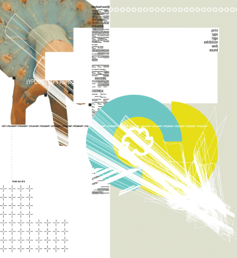
A work of typotherapy+design.
Please explain the contents of the second TEKKO specifically. Could you please tell us your feeling as an organiser of this event now?
TEKKO 02 consists of 8 international design studios exhibiting a 9 by 9 foot printed “mural”. The content for each work was totally up to the individual studio. This particular exhibition is non-thematic by consensus.
I heard that the scale of the exhibition will be wider with displaying murals in this time. Did artists come to Canada to produce their murals? It sounds interesting that the artists, who are in the forefront of designs, participate in this event, such as Buro Destruct, Matt Owens, Rinzen and others. Have you got any special reasons for choosing them?
Actually the murals in the end had to be printed instead of being painted straight to the walls. The costs were far too great, so no… nobody came to Toronto to produce their work. It was all done on a large format digital press by a company called moveable. Each design is 9×9 feet and broken up into three panels that are 9×3 feet.
In answer to the second half of that question… I have spent a lot of time building positive relationships with everyone involved so to me it is no surprise that the studios I have picked want to be apart of TEKKO. So I guess the real answer is I seek out studios I like and try to build a personal relationship first, if that goes well then I ask them if they want to be in TEKKO.


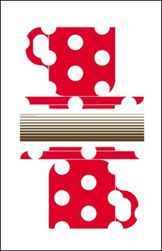
Left: A work of typotherapy+design. Right: A work of Buro Destruct.
“Tekko is a free place where designers can express their thoughts and work”, isn’t it? Do you think the significance of TEKKO is getting deeper every time it hits its new round?
God I hope not, I really don’t want this exhibition to turn into a Bruce Mau Manifesto. I mean the real point is that our daily interaction with design is in a market value context and TEKKO is an opportunity for studio’s to forget about all the crap they get from clients and see themselves and their work in a different context. I want it to stay fun and intelligent as possible but at the same time I do not want to put on exhibitions that stink of “clientesque” work. That’s the feeling I get when ever I go to a Bruce Mau exhibition here in Toronto, it just looks like expensive client work and not contemporary design or even contemporary art (of course this is subjective and my personal opinion). Sorry BM.
Read more ...


