MATT OWENS
PEOPLEText: Satoru Tanno
Matt Owens, who is known as a gifted graphic designer as well as a skillful web designer in New York, contributed the cover design to SHIFT.
Working on a great deal of web designs, print works, motion graphics etc, he maintains an experimantal web site, volumeone, which is highly regarded by many web designers worldwide. SHIFT interviewed him about his design policy, web design in New York, what he is trying to achieve in the field of web/graphic design.
First of all, can you introduce yourself?
My name is Matt Owens, I run volumeone, a visual communications studio in new york, started in 1997. For two years I worked as a senior designer and then as the creative director for Methodfive, a web development company in new york. Previous to that I spent two years at cranbrook academy of art getting a masters degree in graphic design. I was born and raised in texas.
Can you tell us about your web site volumeone?
Volumeone serves two purposes. First, volumeone functions as an experimental laboratory were I can work on navigational, visual, and narrative ideas that I find interesting. Often, client work does not facilitate exploration and innovation given time and budget constraints so volumeone serves as a forum for ideas to materialize.
Secondly, volumeone serves a promotional purpose. Published every season, volumeone is a kind of self imposed creative dialogue. I want clients and other designers to be exploring different communication possibilities and breaking new ground and the only way to really forward these kinds of dialogues is to work through example. Everyone wants to do interesting work. The question is, do you wait for it to come around or do make it happen. I try to do the latter.
What do you think the most important about the web design is?
Within web development in particular, the talents of traditional graphic design, interface design and information architecture are fused together. Exploring how these three fields can work together most effectively lies at the center of successful communication on the internet. Traditional graphic design skills involve not only composition and information hierarchy, but developing the visual languages that will be most appropriate for a given project. Interface design and graphic design intersect as visual communication and navigational challenges work seamlessly together to form a singular experience. lastly, visual communication and navigation must operate within the technological foundations upon which information architecture relies. This results in an inherently challenging environment where (ideally) new forms of expression are the outcome.
What are you most interested in now?
I am most interested in rounding out my design ability into a broader context. I am really interested in doing motion graphic work and more print projects as well. With regard to web development, I want to work collaboratively with strong a technological team where design, content, interaction and navigation can develop into more sophisticated and interesting experiences. Increasingly I think you will see an interrelationship between web, print, tv and interactive media whereby design will serve as the conduit between cross-media visual communications problems. I would like be a part of defining this merging process.

As the cover graphics of SHIFT was done by you, can we have some comments about the graphics?
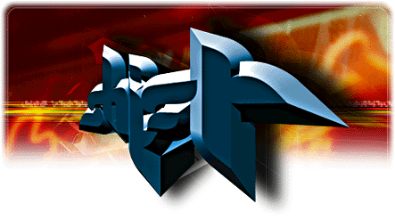
The cover of SHIFT was done pretty spur of the moment. As satoru knows, I was interested in doing something a little more happy and cute but since Brian at Sunshine Design had already covered that last cover I decided to go in the opposite direction. I got the Lemon Font by G2SYSTEMS, which I love for its visual line qualities based in the lemon shape. However, there are no English letterforms. So I went in and took specific aspects of the letterforms from the Lemon Font and used them to spell Shift in English while retaining the visual qualities I found appealing. Next, I put the newly created letterforms into a 3d program and extruded them and gave them a light source. A few weeks ago I had taken several photographs of signage and colorful barbershop poles around Pell and Elizabeth streets in New York. One particular shot was of red neon letterforms in chinese (I think) and I used it as the background for the cover and dissolved it into the white of the page. I think it creates a nice depth in contrast to the 3d letterforms. Lastly, the horizontal lines perform a grounding function, giving the letterforms a balancing point. Overall, I think the cover communicates an atmosphere and an attitude as opposed to a specific concept. And this is what Shift is to me in a lot of ways. A feeling and an attitude that results from the sum of its parts.
Read more ...


