JOSEF ALBERS: PEDAGOGICAL EXPERIMENTS
HAPPENINGText: Alma Reyes
It would be amiss not to scrutinize the artist’s preoccupation with color experimentation, for which he was widely known for. From Black Mountain College to Yale University, where he was appointed chairman of the Department of Design in 1950, and onwards, Albers engaged extensively in color projects, developing the properties of quantity, relativity, transparency, and what he called “subtraction of color”, which involves making two different colors look alike by the layers you place around them. He remarked, “In visual perception a color is almost never seen as it really is — as it physically is. This fact makes color the most relative medium in art.”
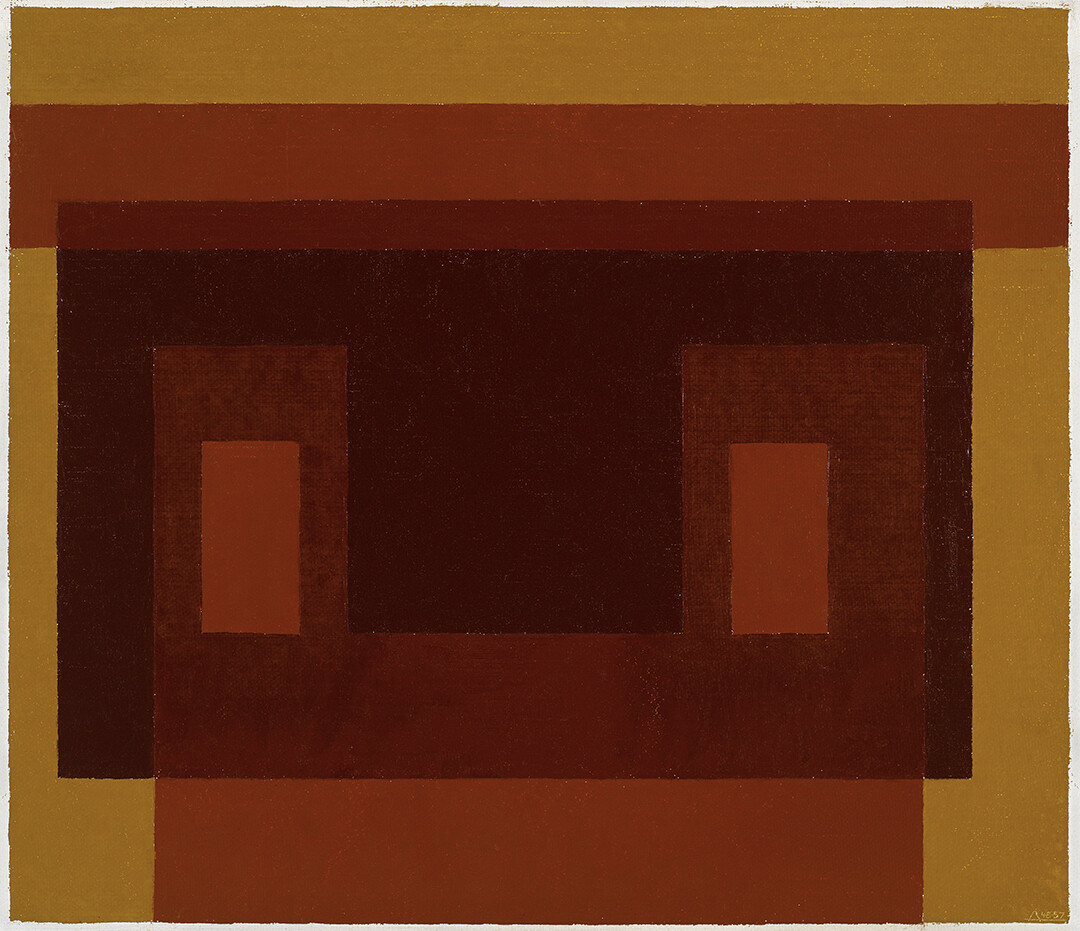
Josef Albers, 3 Browns + Ochre, 1948–57, The Josef and Anni Albers Foundation © The Josef and Anni Albers Foundation / JASPAR, Tokyo, 2023 G3217 Photo: Tim Nighswander/Imaging4Art
From 1947, Albers embarked on the “Variant” series based on several studies on one subject to study the multiple effects and color changes that cause discrepancy. During his numerous visits to Mexico and Southwest America, he was believed to have been inspired by a house made of adobe bricks in completing the painting of 3 Browns + Ochre (ca. 1948–57).
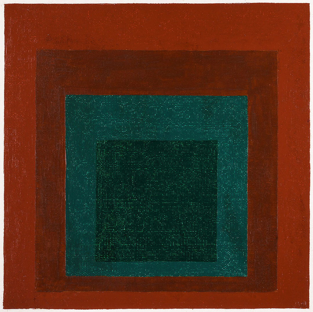
Josef Albers, Study for Homage to the Square: Coniferous Center, 1961, Foundation Arc-en-Ciel/Hara Museum Collection © The Josef and Anni Albers Foundation / JASPAR, Tokyo, 2023 G3217
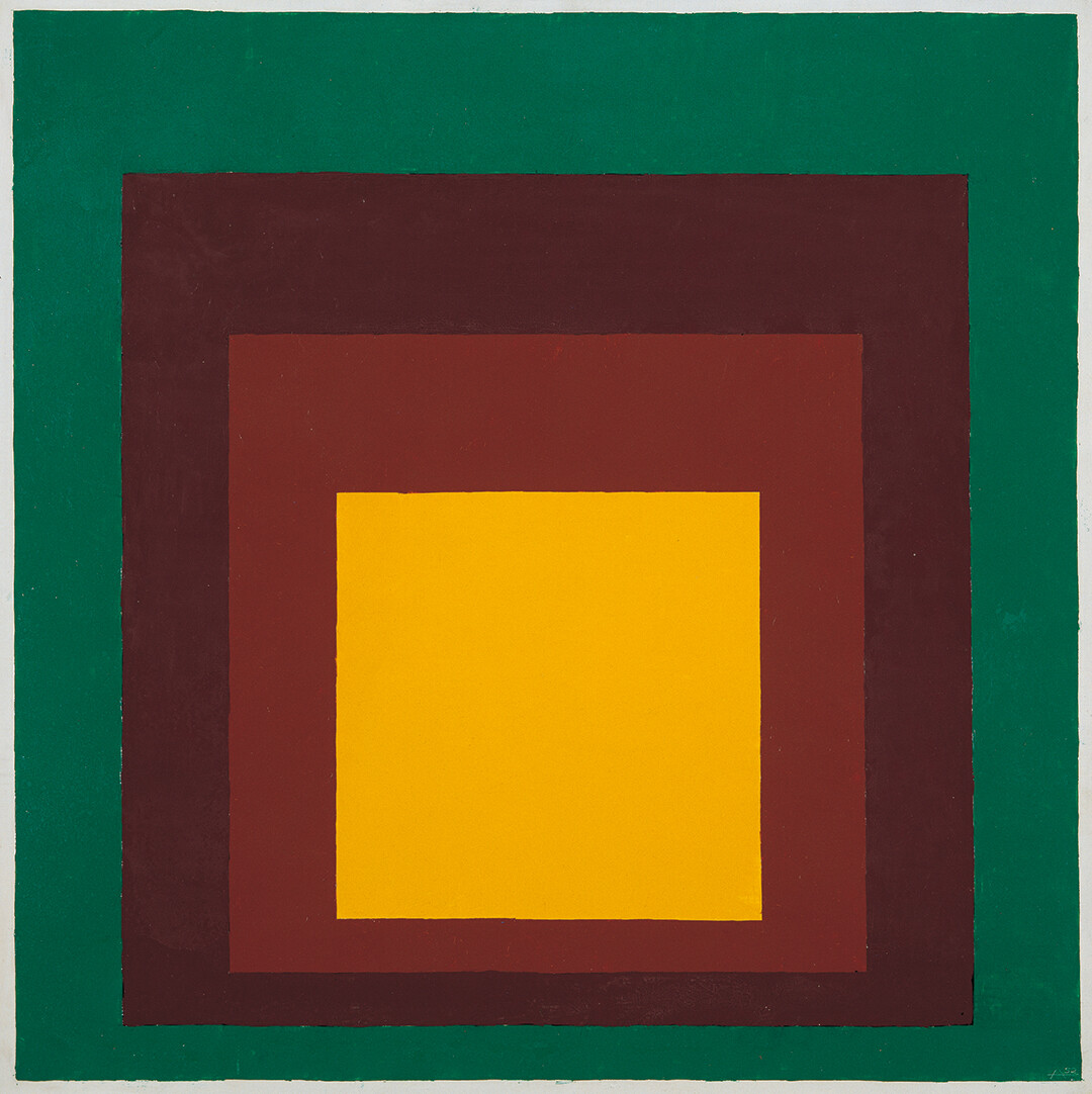
Josef Albers, Homage to the Square, 1952–54, Kawamura Memorial DIC Museum of Art © The Josef and Anni Albers Foundation / JASPAR, Tokyo, 2023 G3217
Albers’ series of over 2,000 paintings from Homage to the Square (1950-1976), published book Interaction of Color (1963) and the print portfolio Formulation: Articulation (1972) were the most significant references of his color theories. The exhibition presents countless walls of paintings from Homage to the Square, which Albers constructed continuously for twenty years. The format typically frames four squares in gradating sizes, and in themes of green, blue, yellow, brown, red, orange, and more. The central square appears to sink deeply inwards, while the other squares around it illusively overlap equally toward the center. The relativity of colors prompts us to imagine translucent or transparent layers that intersect with each other. An informative film depicts Albers explaining his painting method. He rarely mixed colors, but used paints directly from the tube, believing that mixing colors reduces potency and “detracts from their purity.” He also worked with a spatula or palette knife, not a brush, to “avoid personal structure and stay solely with the color.” At first glance, you may interpret the works as mere patterns of plain squares, but soon discern the wavering degrees of intensity from bright to dark (and vice versa) and their surprising effects on the eyesight. He summarizes his color course in Interaction of Color, which also includes assignments made by his students. In Formulation: Articulation, the exhibition presents 15 prints (out of 66 plates) with accompanying texts written by Albers himself, detailing the process of interpreting color perception.
To experience this image interplay, pass the workshop space where you can practice combining pieces of colored paper while applying Albers’ guidelines on color manipulation, and eventually produce a piece of art.
As Albers stated, “Art is concerned with the HOW, not with the WHAT; not with literal content, but its performance of the content. The performance — how it is done — that is the content of Art.”
Josef Albers: Pedagogical Experiments
Date: July 29th – November 5th, 2023
Opening Hours: 9:30 – 17:00 (last admission 16:30)
Closed on Mondays (except October 9th), October 10th
Place: Kawamura Memorial DIC Museum of Art
Address: 631 Sakado, Sakura, Chiba, Japan
Tel: +81 (0)50 5541 8600
https://kawamura-museum.dic.co.jp
Text: Alma Reyes


