
OFFF FESTIVAL 2006
One of the best conferences this year is an experiment by the organizers of the OFFF themselves. They arranged a joint conference called “How to do things with data” by Jonathan Harris and Marcos Weskamp.
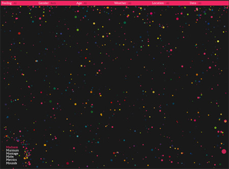
wefeelfine.org presented by Jonathan Harris
Jonathan shows an amazing application called “We feel fine“. We feel fine is a community project where the user can leave a message attached to a feeling. This message can also contain a picture. The application visualizes all users as colored dynamic particles smoothly moving on the screen. Each particle represents the nature of the feeling as visualized by its properties (color, size and opacity). The visitor can filter the data and visualize the filtered results such as all feelings by men in theirs 30s on a cloudy day. One of the most impressive features of this application is the way how Jonathan reuses the particles to visualize live different process stages, thereby creating a very nice flow through the application.
We feel fine also has an open API based on XML. This API lets other developers visualize data in other applications such as a Flash by accessing and parsing the XML data. Marcos Weskamp shows a small example of that including a live visualization of filtered We feel fine data within a Flash motion piece.
Marcos also presents a very popular project called “Newsmap“, which visualizes a landscape of Google News information by using tree-map algorithms distributed by regions. Marcos demonstrates how information can be more optimized in terms of visualization.
Jonathan also shows a very popular news visualization application called “10 by 10“. “10 by 10” lets the visitor have a very quick view on what happened in the world in the last hours by showing 100 pictures and their related headlines within a 10×10 grid. The grid is built from data by Reuters World News, BBC World Edition and the New York Times International News. It is refreshed hourly and stored into an archive, with past views being accessible at any time. Jonathan shows how important moments can be especially appreciated by repeating the same pictures within the full grid.
Another very interesting project from Jonathan Harris is “wordcount“, which shows a list of the most popular English words. The interface allows the user to search words and locate their rank. Jonathan also added an extra application called “querycount”, which lists the same words by counting the most popular users’ wordcount queries. The first word we can find in querycount is “sex”, which is ranked #1236 in the wordcount.
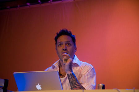
Joshua Davis during his speech. © Borja Delgado
Bradley Grosh wasn’t able to come to the festival. Unfortunately his father had a car accident, and we all hope he is fine by now. Joshua Davis, who was not supposed to speak this year, took the stage instead to show his last project “BMW Z4 by Joshua Davis“. Once again Joshua uses his generative system to create unique backgrounds – in this case he used different shapes of a car.
WeWorkForThem have some technical problems with their laptop and so have to improvise by delivering a short statement about their philosophy. We all want to see their latest work, but unfortunately aren’t able to.
The first day of the festival is closed by Nando Costa. Nando gives a review on his work from his first motion pieces until his last advertising work. A very nice speech surrounded by very nice work and filled with Sao Paolo’s backgrounds.
The day has gone by without the visitors being able to visit the Showplace (exhibition) due to the visitors’ massive use of the open WLAN provided by the organization. OFFF decides to install cable internet access for the Showplace.
Read more ...


