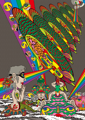
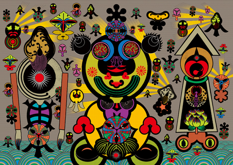
KEIICHI TANAAMI
PEOPLEText: Yurie Hatano
Please tell me about animation production.
The basics of my animation are monochrome, like the Mickey Mouse and the Betty Boop sketches. I still remember how much fun it was to project my hand made paper-film by using a tin made magic lantern. Every one of my works in drawing and graphic design…every expression, has a premise to its motion; and I think every one of them has a moment of movement. An animation that “gives a life is still an image” and is the foundation of all my creations.
Please tell me about your exciting collaborations with Naohiro Ukawa.
I have been doing a lot of work with him including: Exhibitions at Kirin Plaza in Osaka; The visual work and CD cover design for Supercar; Some videos; A live painting video for Yamaha and so on. We always have a lot of fun collaborating and work without regard to age. It’s very thrilling and full of variety. We don’t have generational commonalities or for that matter environment and experiences, but for me it is very interesting. He rarely throws an easy ball. Actually it’s mostly unexpected balls all the time. Sometimes it would be a dangerous one or almost an invisible fast- ball. I’m looking forward to presenting more radical and exciting performances with him.
Why do crests appeal to you?
Different from European crests, everyone could have their own crest in Japan. Arranging crests became popular, as they have been arranged in thousands of different ways resembling varieties of shapes like animals, plants, the sun, clouds, thunder, waves, and words. The interesting thing is, I was told that this couple got married, and that they each had their own crest, so they ended up having a new crest that combined their original crests. Isn’t that romantic? And, people could design their own crest if they don’t know theirs. So crests today survive after all the different arrangements have been made. This has made the Japanese crest interesting. No one ever hears about crest designers. There is no literature. However, each crest design today is of extraordinary high design. For example, there are thousands of corporation logos that have the idea of crests. Even Louis Vuitton’s monogram is an arrangement of Japanese crests. Crests have so much power as a design source. I also often get ideas from them. Probably, it is very hard to make something like this high design even for the designers now. Really, this is well-developed as if they reached the highest point…what great craftsmanship.
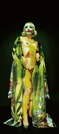
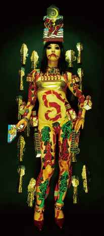
Keiichi Tanaami x Chiya Namegai, Photo: 427FOTO
Lastly, do you have a message for the readers?
My motto is “Do what I like, in a way I like”. I’m affected by Taro Okamoto’s remarks and books that I used to enjoy in my youth, and there is a lot of power in ‘living my life now’. The meaning of these words themselves are easy to take, but the substance is very difficult to understand. First of all, it is hard to find what you like to do, and it is more difficult to get a job that you like and keep it. Then to “do that in a way you like” would be a Herculean task. You must have talent and make more effort than others. Human relationship is also an important factor. To live as you like could be the hardest thing. However, if you ever get a life like that, it would be the happiest thing for people, I believe. I’d love for young people to try this.
KAMON Design Exhibition
Date: April 1st – 27th, 2007
Open: 11:00 – 21:00
Place: SOSO
Address: 1F Sansei Bld., South 1 West 13, Chuo-ku, Sapporo
Tel: +81 (0)11 280 2240
http://www.kamondesign.com
Text: Yurie Hatano
Translation: Kimiyo Nishihara