FONS HICKMANN “TOUCH ME THERE”
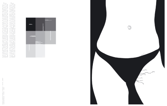
The book starts with a typographical play. Fons Hickmann change the title from “Touch Me There” to “Touch Me Here”. The following three pages are designed with three detail photos of three different skin types. A part of our body which is very sensitive and is also one of our five senses, that reflect and illustrate the title of the book in the best way.
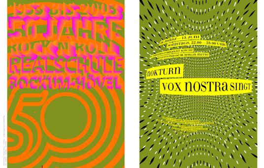
The first chapter introduce the work about social themes, like immigration in Europe or a project in corporation with the Catholic church. So you will see very fast that studio Fons Hickmann sometimes handle with old themes, but bring them in a new fresh way, go with the 21st century, communicate in a modern graphical language.
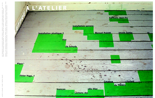
About the graphical language of his studio, I recognize by looking at this book, that the studio has not an uniform style, the change their aesthetics from subject to subject. Then every content and context needs a different aesthetic. I saw also that the studio always has an intense grapple with every topic they work on. They always try to expand the artistic possibilities, to stay original, without looking for trendy effects.
The studio comments on political, cultural and social topic to call the people. Fons Hickmann is also care about the design tradition in Germany. For example Fons Hickmann build the cooperation 11 designer against the new “bad designed” WM football logotype for Germany 2006. There is a lot of involvement for the German culture and design in generally.
Touch Me There
Created by Fons Matthias Hickmann
Specification: 472 pages, 220 x 280 mm, full color, German / English
Release Date: August 2005
Price: €39.90 / $59.00 / £29.00
ISBN: 3-89955-079-X
Publisher: Die Gestalten Verlag
verlag@gestalten.com
http://www.gestalten.com
Text: Tim Engel